heidl
-
Posts
180 -
Joined
-
Last visited


.thumb.png.6c03f89f2af98580d5533068d16d6501.png)


-
 Laserschwert reacted to a post in a topic:
The Custom Covers Thread
Laserschwert reacted to a post in a topic:
The Custom Covers Thread
-
 Yavar Moradi reacted to a post in a topic:
The Custom Covers Thread
Yavar Moradi reacted to a post in a topic:
The Custom Covers Thread
-
@Steffromuk Oh boy, you're just flooding the thread with your infinitely awesome custom covers, so much so that I couldn't even get around to praising @Laserschwert's fantastic Outcast mockups.
-
heidl reacted to a post in a topic:
The Custom Covers Thread
-
heidl reacted to a post in a topic:
The Custom Covers Thread
-
heidl reacted to a post in a topic:
The Custom Covers Thread
-
heidl reacted to a post in a topic:
The Custom Covers Thread
-
heidl reacted to a post in a topic:
So Disney has ordered a direct-to-Hulu Alien movie - The Alien Romulus thread
-
 heidl reacted to a post in a topic:
The Custom Covers Thread
heidl reacted to a post in a topic:
The Custom Covers Thread
-
 heidl reacted to a post in a topic:
The Custom Covers Thread
heidl reacted to a post in a topic:
The Custom Covers Thread
-
Holko reacted to a post in a topic:
The Custom Covers Thread
-
raferjanders reacted to a post in a topic:
The Custom Covers Thread
-
a good little monkey reacted to a post in a topic:
The Custom Covers Thread
-
greenturnedblue reacted to a post in a topic:
The Custom Covers Thread
-
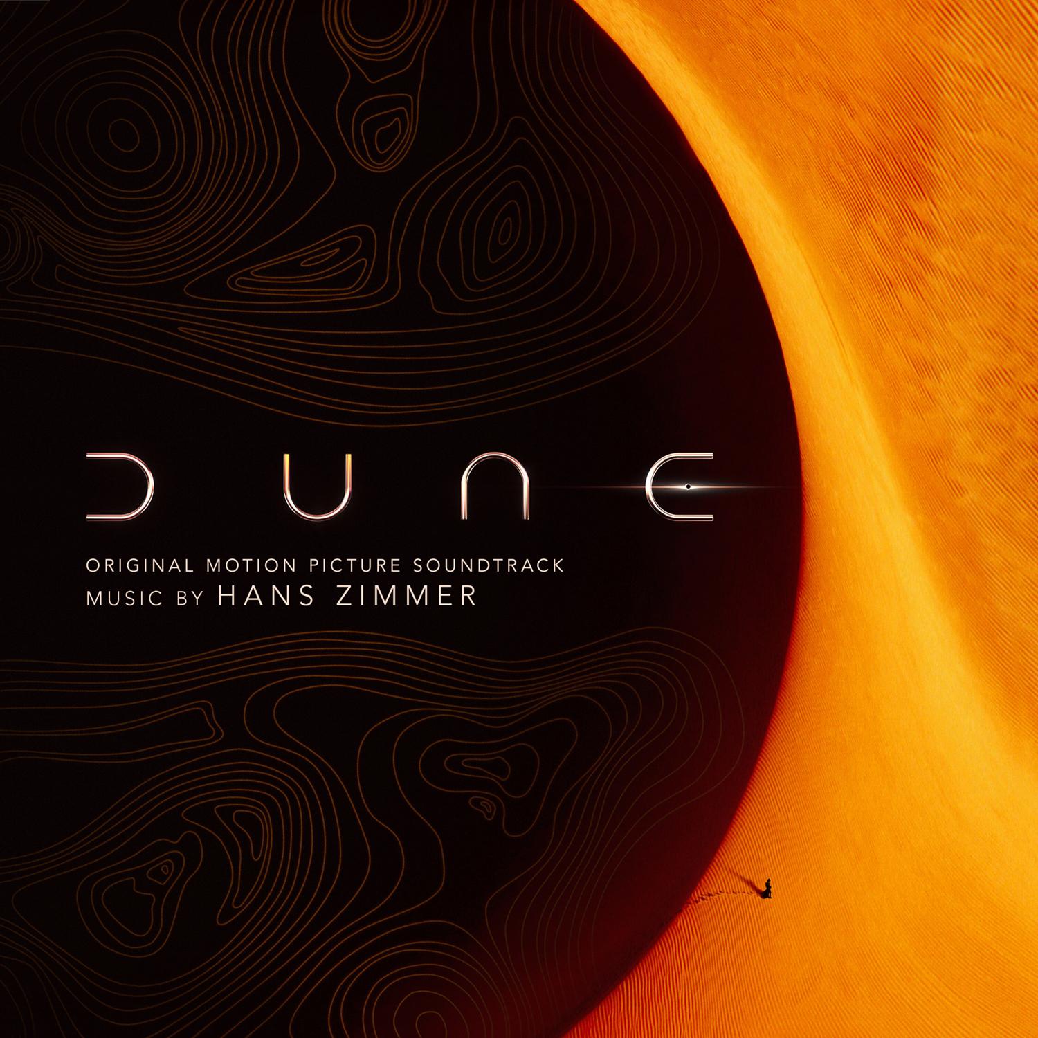
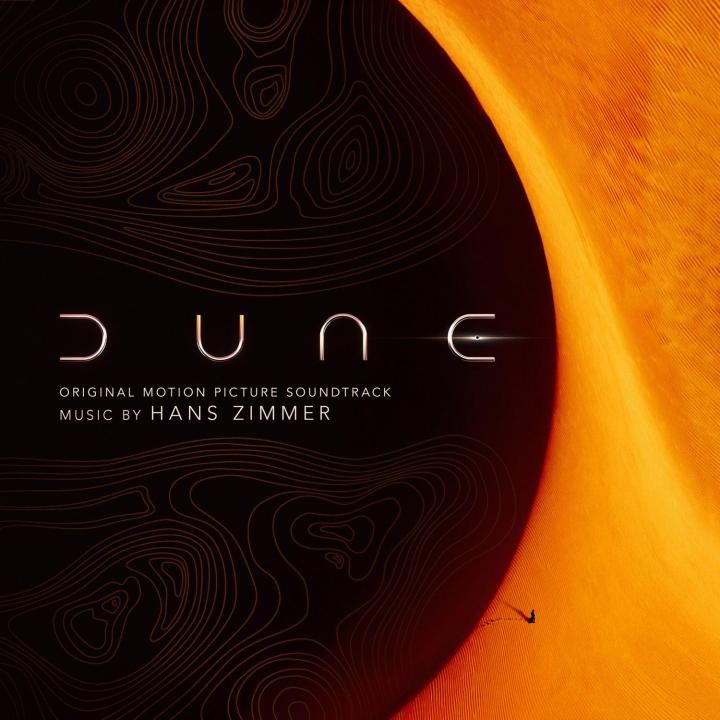
Taking my stab at DUNE


-
heidl reacted to a post in a topic:
The Custom Covers Thread
-
heidl reacted to a post in a topic:
The Custom Covers Thread
-
heidl reacted to a post in a topic:
The Custom Covers Thread
-
Andy reacted to a post in a topic:
I just tracked down a decent looking copy of the 1993 Anthology editions of Star Wars
-
enderdrag64 reacted to a post in a topic:
I just tracked down a decent looking copy of the 1993 Anthology editions of Star Wars
-
Mr. Hooper reacted to a post in a topic:
I just tracked down a decent looking copy of the 1993 Anthology editions of Star Wars
-
alawill75 reacted to a post in a topic:
I just tracked down a decent looking copy of the 1993 Anthology editions of Star Wars
-
The BEST news! And then Interstellar on top of it! Admit it, you only chose that to be able to make the joke about the time dilation You even thought of using one of my custom covers again, I'm really over the moon. Can't wait to dive in! Thank you for being back.
-
 I'd say yes, you'll probably love it. I've heard pretty good things about Star Wars.
 -
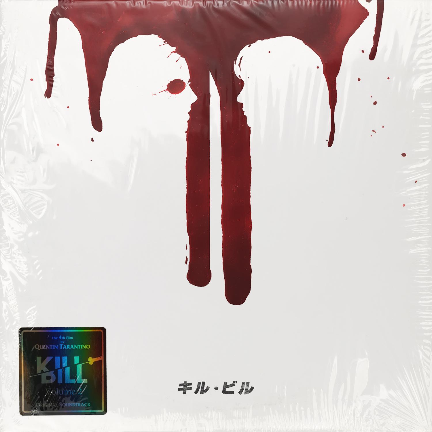
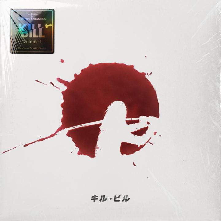
Kill Bill (Volume 1 and 2) (Sources here and here) (Source)


-
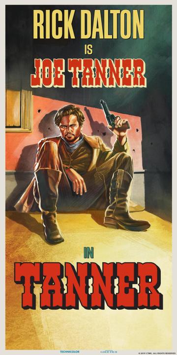
I have also started to integrate AI into my workflow and the results are sometimes really amazing. But AI is clearly not going to replace a designer; in its current state, it is simply another, admittedly very powerful tool to help you get the results you desire. Examples: Star Wars Once Upon a Time in... Hollywood The Orphanage


-
The TPM cover looks really bad when viewed full size, very pixelated. Also, I will never understand why they seem to have randomly mixed the Albertus and Trajan fonts in these designs. Also also, it really bothers me that the logos and text don't line up. At some point I really need to redo these covers....
-
Oppenheimer Ludwig Göransson Official posters: Fan posters: Poster credits: Arvindh Krishnan William J Harris Agustin R. Michel


-
I did https://hqcovers.net/2018/08/08/the-meg-by-harry-gregson-williams/
-
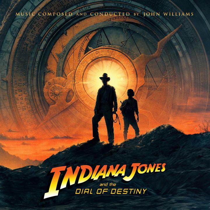
OK, so I wanted to see what the other scores would look like with the Dial of Destiny "design". It turned out.... they look like crap!


-
Nothing speak against it, if there are high-resolution images available. I'll take a look.
-
Thanks, it was you who inspired me to do it. And it was quite fascinating to see your PSD and your workflow. Thanks again, bud!
-
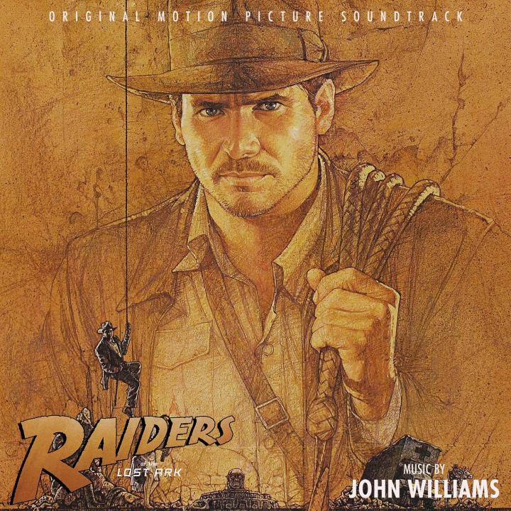
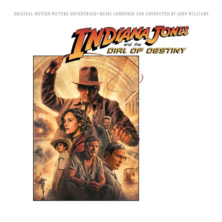
I went back over my previous "Crystal Skull"-inspired cover and replaced the official 1-sheet with the new gorgeous poster by Matt Ferguson. Also, @crumbs was so generous to let me borrow his awesome Dial of Destiny cover design to use it for 4 more Indy covers. So, to mark the occasion of a brand-new JW score, here is a completed set: (c) crumbs


-
New covers for Indiana Jones and the Dial of Destiny


-
HOLY SHIT THAT SUCKS! It's almost comical how bad this cover art is. As if the underpaid and burnt out designer said screw it and shat together the quickest and worst possible version of an album cover. And they bought it muahahaha