


andrewz
-
Posts
24 -
Joined
-
Last visited
1 Follower

Recent Profile Visitors
1,085 profile views


-
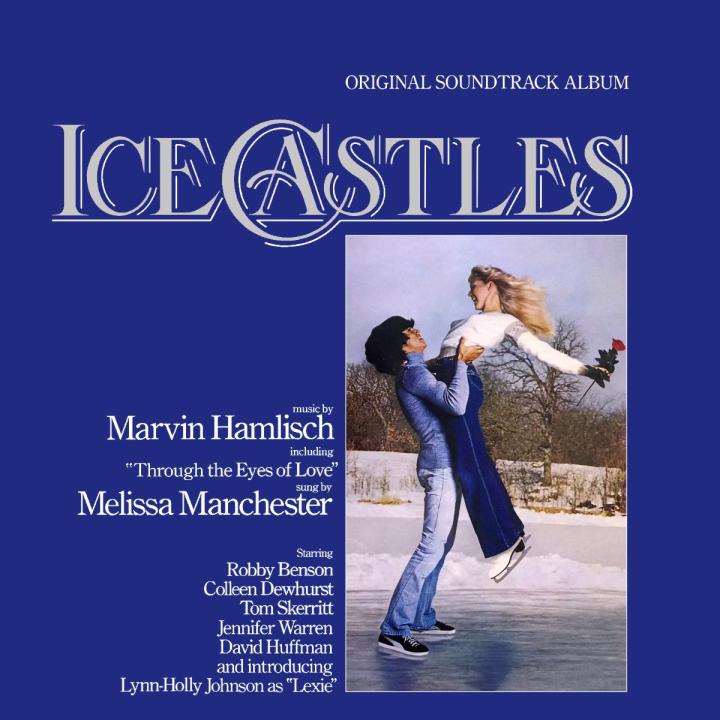
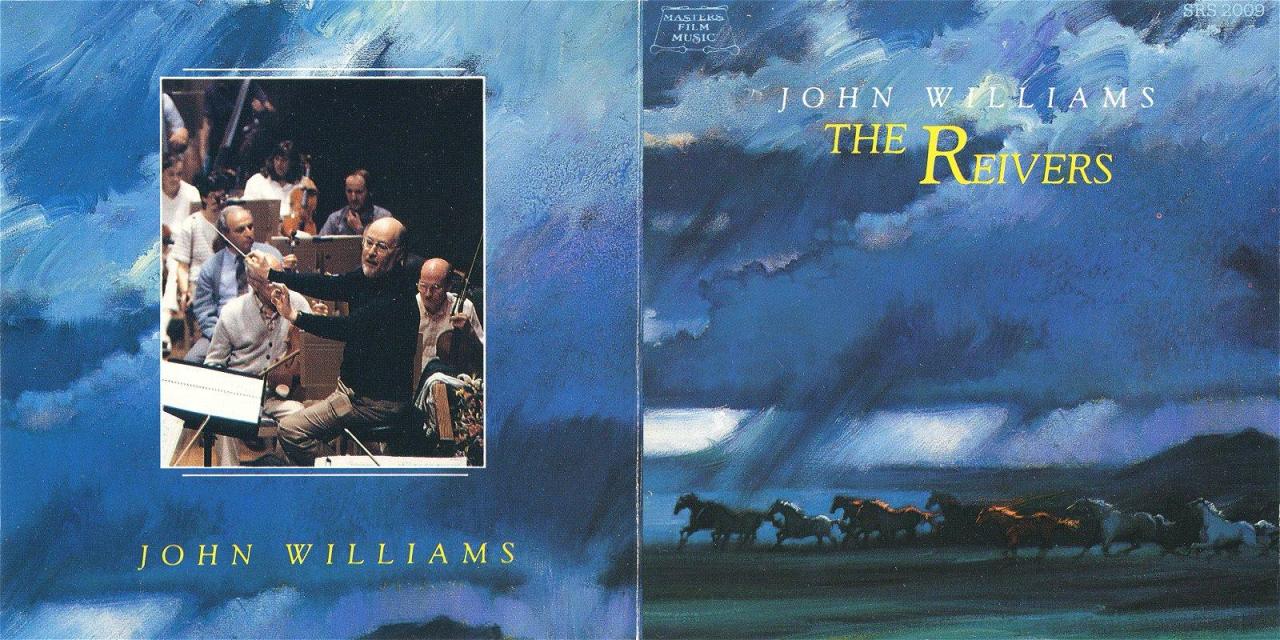
Marvin Hamlisch's Ice Castles can be found in my gallery here. Regarding John Williams' The Reivers, could you please send me the vinyl album art from Album Art Exchange (the original and least compressed file – I got banned) and pinpoint the differences from CD album art?
-
Do you mean this? http://johnwilliams.free.fr/img/covers/reivers80_front.jpg
-
 Hi. You can find 1500×1500 px version in my gallery. Merry Christmas!
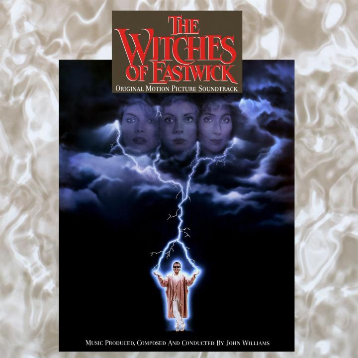
- 473 replies
-
- 4
-

-

-
- The Witches of Eastwick
- John Williams
- (and 2 more)
-
Tydirium reacted to a post in a topic:
The high resolution album art request thread
-
Hi. You can find 800×800 px version in my gallery.

-
Jurassic Shark reacted to a post in a topic:
The high resolution album art request thread
-
I'm sorry, I don't have a general knowledge in this specific area. Affinity Photo is said to provide best ratio in terms of features/price, so if you can invest some money, this could be the right choice. But you can start with GIMP. You have to get used to the UI, but it is free and pretty competent. The best from all of the named tools is probably Photoshop, but it ain't cheap (subscription only) and you will very likely not need all of it's features. Have a look at some tutorials on YouTube and choose what best fits your needs.
-
I guess you are interested in improving detail with AI. They say the best is https://imglarger.com (but there are many similar tools). It works pretty well, if it works at all. It use to be overloaded very often. But the key is to obtain highest quality source material and use the tool at the right time of the retouching pipeline. In case you are interested in bitmap/raster editor software, there are many well known options from freeware https://www.gimp.org to commercial Corel Photo-Paint, Affinity Photo or Adobe Photoshop. All of them do pretty much the same thing. it's up to your preference.
-
Herman Brood - Bühnensucht cover is up. The difference might seem subtle at first, but I improved detail by using artificial intelligence, reduced compression artifacts, undone crop and cleaned labels among others. In case you have some ideas, send me personal message. Posting directly to this thread is better for discussion of more people, not peer-to-peer conversation. Others might feel like being spammed, since they might receive notifications on new posts. Odd Man In in PNG in your folder was a mistake from my side (and yes, the file format was the reason behind the excessive size). When it makes sense, I upload covers in PNG to my gallery in order to avoid compression artifacts (anticipating that people will crop it, resize and reformat the picture on their own). JPG is better format for music libraries, since it has wider support by music players. Scans and photos you made are already good sources to create good Little Richard cover, but making two separate photos like below could give us even more detail. I could put these photos together in computer.
-
Cropped version is up. I was happy to do it for you. Cropping and downsizing is the easiest part. That's why I upload the largest and less cropped versions so that anybody gets flexibility to edit it the way he or she prefers. In case you have so specific needs, I recommend to learn how to do it yourself. It is not a rocket science. IrfanView can do it for you in a few steps and the tool is free. It will come in handy for you in the future. I used to upload my edits to AAX, but it turned out that it's owner Scott Rob is toxic elitist and narcissistic usurper. He is not repelled by collecting lots of covers from his users, then blocking their access to the site via security software called BlockScript and banning them for life in case they ask why he is so unfair. This disgusting practice (which I personally experienced) is very common and well documented online (let me make clear that I'm not defending edjgraphix either). The guy says to have a deal with record labels, but is unable to acquire digital quality covers from them (that's why I doubt the deal) and claims ownership of covers he uploaded, ignoring a fact that somebody else designed (or photographed) it and holds copyright for it. Compared to his ill attitude, I don't profit from my work financially and I'm not telling anybody what he or she is entitled do to with pictures I upload. If you'd like to upload my edits to AAX, I have nothing against it. After all, people are already doing that. In a digital world, it is impossible to have any control over it. It is sad that Scott Rob is refusing to accept it. I'm not able to imagine that record companies would protest against somebody promoting their records, which is exactly what is going on here. There is nothing wrong in buying MP3s online or ripping your original CD and attaching nice cover to it in order to make the listening experience as comfortable as possible. On the other hand, it's very sad that in 2020, you have to deal with this crap on online music markets. If this was not the case, AAX would not have to exist and I could spend my time doing something else.
-
Last Man Standing is up. I will upload 1200x1200px versions here just for you :-)
-
Homogeneity and adequacy is the key (same amount of light in every part of the cover, but not too much). I can do any manipulation with it in a computer, but I cannot create details that does not exist (like burned out highlights) and I cannot easily redistribute the light if not homogeneous. Photos above are quite good regarding light, but you could pick more details with the same gear if you framed it properly (=pick just the labels). The best way is to put the cover on the ground in the open and avoid (own) shadows.
-
I prefer photos. Yes, scanners have no perspective distortion, but as I said, mainstream cameras deliver better overall quality than mainstream scanners (and samples you provided before clearly prove this).
-
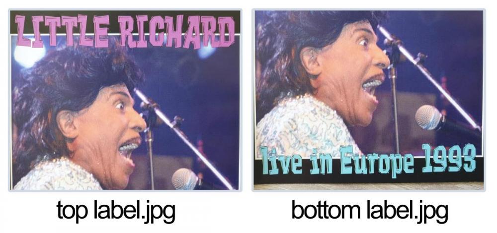
There were few misunderstandings between us. I'm not restoring covers for profit, but for love of music. Thanks for your financial offer, but I will either do the best to fix the scan/photo, or reject the request. I previously thought that you already found a perfect cover for Buhnensucht. Now I see it is not the case (you meant that you found source materials in good quality enough), so I will try to give some love to the scans/photos you already sent. I always try to capture the core of each cover, since it slightly varies from release to release and label from label. Having seen this version of Odd Man In, I assumed that those labels are related solely to the release and not the original cover. When working with typography, I always try to establish some order like giving individual glyphs the same look + making spaces between words and even letters (have a look at "IREN E") and lines the same size + put glyphs in the same level (look at bottom line of "ODD M_A_N IN"), since lots of this is affected on photos and sometimes on scans. That's why I personally prefer entirely reconstructed version. In my previous post, I also linked a version that contains no edits except the missing letter. If you prefer fusion of both versions (retouched background photo and original labels with the missing letter fixed and most other imperfections intact), I recently uploaded this version here. Regarding Little Richard cover, could you please use the entire frame of a photo to capture just the label positioned horizontally/vertically as much as possible? (Your camera may offer you to display a grid when making a photo. Except 90 degrees, rotating an image in computer always leads to artifacts and loss of detail.) One photo should ideally capture the top label and second photo should capture the bottom label. This will give you as much detail as possible with the same gear. Right now, I'm working on Last Man Standing Live. I will have a look at the rest of covers later. Meanwhile, you can try to find better versions of covers you requested recently, since these are pretty low quality (although better than the first Little Richard).
-
I noticed more backlogs than just missing letter, but if you prefer just fixing this issue, here you go. Good job finding better quality versions! As you wish, I will omit Herman Brood cover. If you could make some more source material for Little Richard cover, that would be great.
-
The better the source material, the better the result. If you could make several photos of the same cover (with emphasis on labels except Jerry Lee Lewis – that is Headline font for sure, so I can generate it from scratch) under homogeneous light conditions, I could put them together. Based on my experience, home scanners do pretty poor job, but you can try both scanner and a camera and we will see what gives better results. Meanwhile, I can prepare labels for the Jerry Lee Lewis cover in case I have some free time until you send me that source material.
-
Hello, Ronan. Jerry Lee Lewis - entire reconstruction is viable. I'm pretty confident that 2500×2500 px (if not more) digital quality result is possible. Herman Brood - I can upscale and clean other 900×900 px scan/photo of the same cover, it could look good in 1200×1200 px resolution. Little Richard - I'm sorry, there is very little I can do. It is an unofficial release and there are no source materials available online. I can smooth out background photo and tune colors, but that's it. Let me know what you want me to do. Best regards andrewz


