rough cut
-
Posts
3,128 -
Joined
-
Last visited
Everything posted by rough cut
-
Yes.
-
 I’m a little bit curious to hear more about the three bonus tracks that end disc 3. Why are they on their own and not in the “songs & alternates” segment - there doesn’t seem to be any overlap? Am I missing something or did they simply not the narrative that Williams, Bricusse and the team tried to create ie “Disc 3 = Hook The Musical”?
 -
The ambition for disc 3 was also lost on me, but it sounds great. I’m looking forward to it!
-
Anyone here succumbed to 4K Ultra HD Blu-ray?
rough cut replied to 1977's topic in General Discussion
Reading your post, I first got the impression you were giving your thoughts on the new 4K transfers. Reading your post a little more carefully I see that isn’t the case. -
Anyone here succumbed to 4K Ultra HD Blu-ray?
rough cut replied to 1977's topic in General Discussion
@Bayesian Is this a review of the 4K trailers or you’re simply watching the full movies from - let’s just say - an “alternative” source before you buy the physical product? -
Ahhh!!!! 😂😂😂😂
-
I don’t know what that means.
-
I cannot recommend Man Men enough. It certainly is a show that has a lot of facets to it, but it might not be obvious from a thumbnail or a synopsis. Besides being a semi-historical account of the birth of modern marketing, it’s such an interesting premise and time period. It might seem as if all they do is smoke and drink and fuck but there is intrigue abound. And the clothes are amazing (and I’m not talking about the women’s fashion, I would kill for those suits that the men wear).
-
I love Mad Men. A fantastic show.
-
Don’t shoot the messenger.
-
A Google translate of the article for those of us who don’t speak French:
-
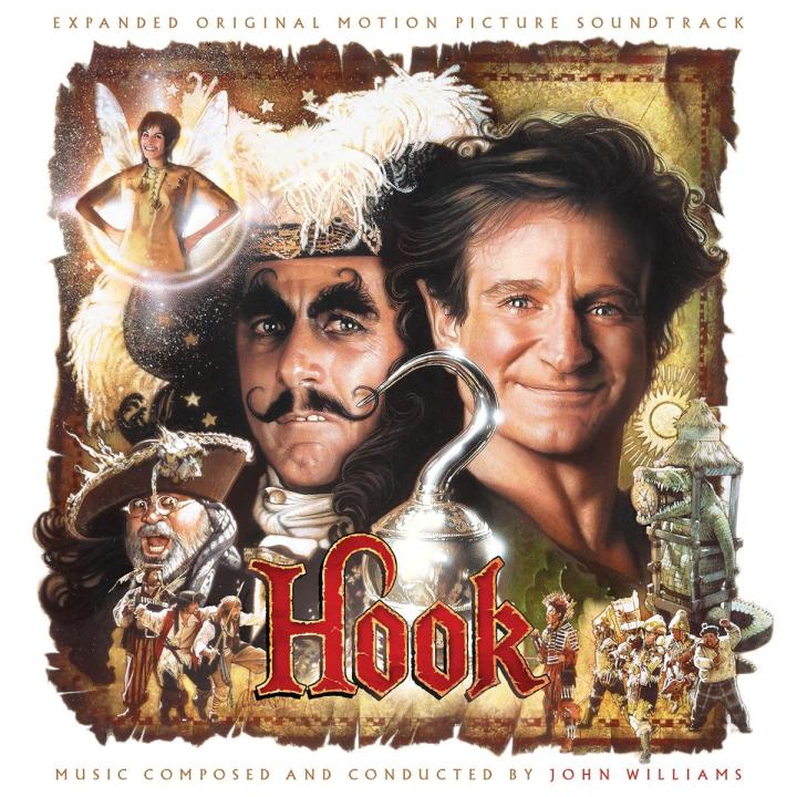
One might say that this release will be off the hook.
-
Yeah, I thought as much in my original post (I don’t begrudge you for missing it though, it was a long post). Still, quite a thing to not just go for new cover art (even if based on original material) but to re-color the logo.
-
Umm, I get that this is a joke (maybe) but your formula is incorrect and the original one is correct: Sorry, if I don’t get it.
-
Mine is Dec 1 to 4.
-
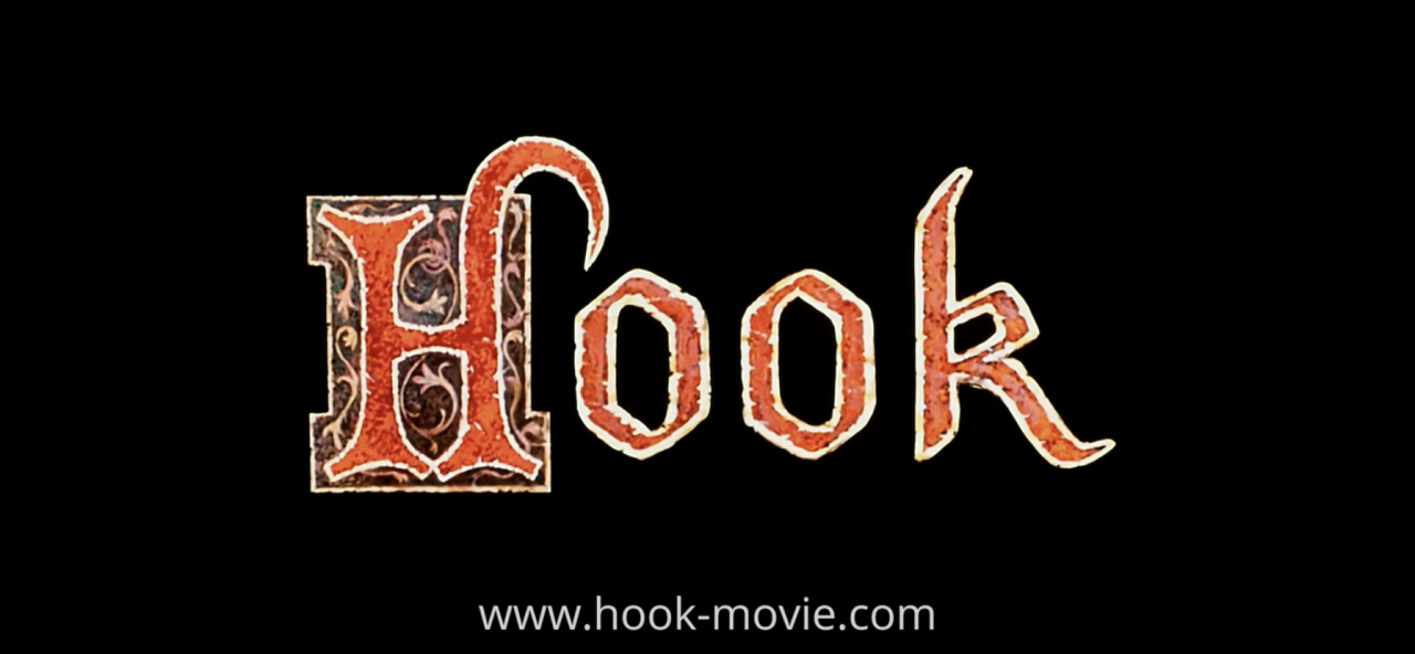
Nothing is wrong - I stated many times that the new ‘ultimate’ cover is beautiful. Possibly, what you interpret as “wrong” is simply curiosity about the design process. I would have hoped that that came across, but apparently not. Here’s hoping to clear up any misunderstanding. Unless I’m looking at the wrong link, it’s clearly not the logo in the teaser trailer. Screenshot: Visuals - yes. Logo - no. It was more common to use different logos/fonts/colors in the 70s and 80s and possibly the 90s… actually the yellow Hook logo on a local/foreign market poster is a good example of this. It’s the kind of thing you rarely see today. Of course this was a time before branding and building global franchises had become the full fledged refined science that it would - but today the standard is to try to contain brand consistency. And a side step from that practice is curious to me. A logo is the unique signifier for all that a brand stands for and is not lightly tampered with as it is the “flag” for the brand it represents. So changing or updating a logo is very rare, unless we’re talking about a re-branding, a modernization or a spin off, where it’s usual to tweak the original logo a bit to make it feel modern and appealing to a new audience. If you are referring to a black logo with a gold edge (as per the ‘ultimate’ edition) that was used for the original marketing during the early 90s which Him Titus might have used as reference - I couldn’t find it. I humbly submit that all I did was a couple of google searches, but I couldn’t find it. If you have an image, please share it because that would be exactly the kind of “source” I was looking for. But just to repeat myself: I like the design of the new set from a pure design point of view - subjectively it is more appealing than reworking a 35 year old poster (but once again, I love that poster and I love the ‘expanded’ artwork). As I have pointed out I have nothing but respect for Jim Titus, which was mentioned not only in the previous post but also in many posts throughout the years. My point now was to scrutinize the new cover from a marketing/branding point of view.
-
Yes, my point was ‘why not keep the original logo’? Of course when launching an updated product it makes sense to create something new so that it feels fresh, but It’s quite a step to go from updating/creating new cover art (which is expected) to redesigning a logo that represents a brand/franchise - beautiful as it may be. I certainly don’t mean to knock Jim Titus’ work or anybody else who worked on this project - the design is beautiful - I’m just curious. Thanks for doing the mock up @Groovygoth666. I’m guessing something similar was on the table during the design process but was abandoned - it’d be fun to hear the reasoning behind it.
-
Comparing the ‘expanded’ artwork with the ‘ultimate’ artwork is really Jim Titus vs Jim Titus. I really thought the ‘expanded’ artwork was perfect, the way Jim had taken the original poster art and adjusting it to the square shape of a CD booklet was such fine work. It’s so well done, the kind of adjustment you don’t really notice unless pointed out to you (which Jim did on his Behance. BTW, Jim, if you happen to read this - thanks for sharing your work process, I revisit this page often, it is so interesting to read about the different projects and how they develop. You are the man!). If one we’re to objectively critique the ‘expanded’ cover one might say that it’s a bit cluttered and busy to look at, but that is hardly the fault of Jim - rather that it it is an inherent quality of Drew Struzan’s original artwork (which I love BTW). However, it is a perfect representation of the original movie marketing, adopted for a CD cover. I must confess, the ‘ultimate’ cover, I found harder to love at first sight. Jim had no easy task here - how do you improve your own work which was already perfect? And to try to top a work that absolutely breathed Hook down to the last pixel? To make it blue, black and gold is an inspired but bold choice - the end result certainly looks beautiful - but, I am curious about how the discussion went to take the artistic choices in this direction? I can’t really remember the movie as being particularly blue - all though the ‘ultimate cover’ does have a “fairy tale night” quality to it which I guess kind of connects it to the movie. Nor was blue a stand out color in any of the old marketing material (full disclaimer: from what I can find on google) but there seems to have been blue posters in some of the countries, so there’s that. Also the BD cover was kind of blueish? Further, it’s an interesting choice to not use the iconic red Hook logo. It’s a bold move putting it in black on an already dark background. It looks almost like a black hole floating in space, barely perceptible but there none the less. Of course the golden outline makes it legible and elegant. All in all, I’m a little bit on the fence about he ‘ultimate’ cover. On one hand, it’s gorgeous to look at, and really appeals to my sensibilities in terms of artistic choices. From this subjective point of view it is an improvement over the ‘expanded’ cover. On the other hand, perhaps it strays just a little bit too far away from the original source material. Perhaps the decision was made to make it as distinctively different as possible from the ‘expanded’ set? That seems likely, but I can’t wait to hear the reasoning behind it. On another note, it’s interesting to see that for the promo material of the ‘ultimate’ edition, the black logo wasn’t used. Nor is the traditional red logo. Instead, a hybrid logo which only highlights the ‘H’ in red is used, a logo that harkens back to the 90’s but had limited use from what I can gather. I get it, on Jim’s new poster the logo color scheme is chosen so that the logo ‘pops out’ from the background and stand out to the viewer. Still, I always appreciate when art direction is such so there’s consistency between products and marketing material. Nevertheless, this CD will stand proudly on my shelf, and it looks gorgeous. I can’t wait to flip through the booklet to see all the eye candy and attention to detail that Jim has in store for us - as he always has.


-
Can’t wait to read the booklet and discover which tracks were ghost written… No, I’m not talking about William Ross, I’m talking about the king of pop himself, Michael Jackson! 😅
-
Yeah, it’s beginning to be really expensive to be a (soundtrack) collector. Each time I place an order, I end up spending +100 euros. I’ll soon need to cut down on my cigars!
-
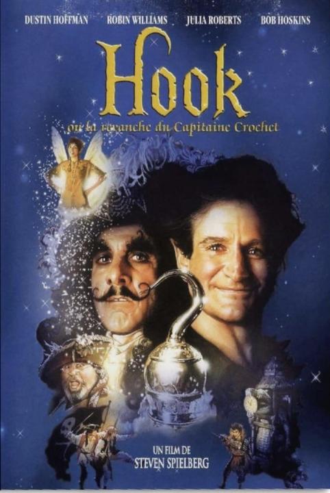
I saw Hook in the cinema back in 1991. But at the tender age of 11, a lot of the themes (in the movie, not the soundtrack) went over my head (Tinkerbell turned regular human size? What on earth was that all about? 😂). I discovered John Williams “the composer” not many years later, in 1993 I think it was (in connection with Star Wars, of course). I was certainly aware of movie themes before that but that was the year when I discovered that all my favorite themes from my favorite movies originated from the same man. And I discovered that soundtracks were a thing. From then on, I’ve been on a life long journey to discover as much as possible of the maestro’s wonderful compositions. Back in those pre-internet days, it was a slow process, compared to anything today. The only way to find out if JW had scored a movie was to A) to watch the movie (also a task into itself since my family didn’t have cable and weren’t big on renting movies), or B) to flip through the scant “soundtrack” selection at the local record store and discover which composer was attached to which movie. There were maybe 10-20 soundtracks all in all to choose from (and not just JW - I mean the total selection consisted of 10-20 soundtracks)! I can’t say for sure at what age I discovered that Hook was John Williams, but it was quite “early” in my fandom. 15 years old? 16? But it was in there with the first slew of John Williams soundtracks I spent my allowance on. Star Wars, Superman, E.T., Jaws, Jurassic Park, Hook… Listening to Hook I fell in love instantly. I am looking forward to listening to the score again and rediscover all those musical moments I once fell in love with. Not to mention all those gems to be discovered in the bonus track section. The set really looks fantastic - for what it already is and was - but also in its new presentation and in all its completeness. Great job done to all involved, especially since it seems to have been a long time coming. Can’t wait to hear the story behind it!
-
This box’ll contain nothing new for those of us who have the 2008 box and/or the stand alone release of DoD.
-
Ah thanks! I haven’t looked at that one for said 15 years! 😂
-
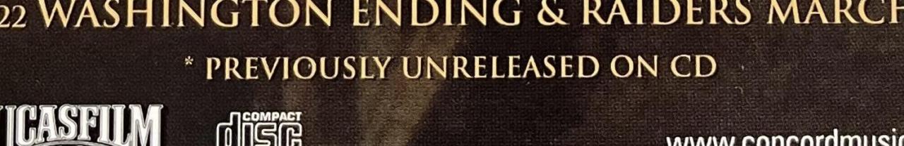
This statement stretches the truth more than a bit, considering the marked tracks were available on CD 15 years ago.