heidl
-
Posts
181 -
Joined
-
Last visited
Everything posted by heidl
-
Wow, where do you keep getting these incredible source images from? I think it's great, the only thing that bothers me is that the "Pete" at the bottom right is hard to read. In such cases I always edit the source image so that the font stands out more and a certain distance to similar colors in the background is maintained. I try to avoid drop shadows as much as possible.
-
@Steffromuk Oh boy, you're just flooding the thread with your infinitely awesome custom covers, so much so that I couldn't even get around to praising @Laserschwert's fantastic Outcast mockups.
-
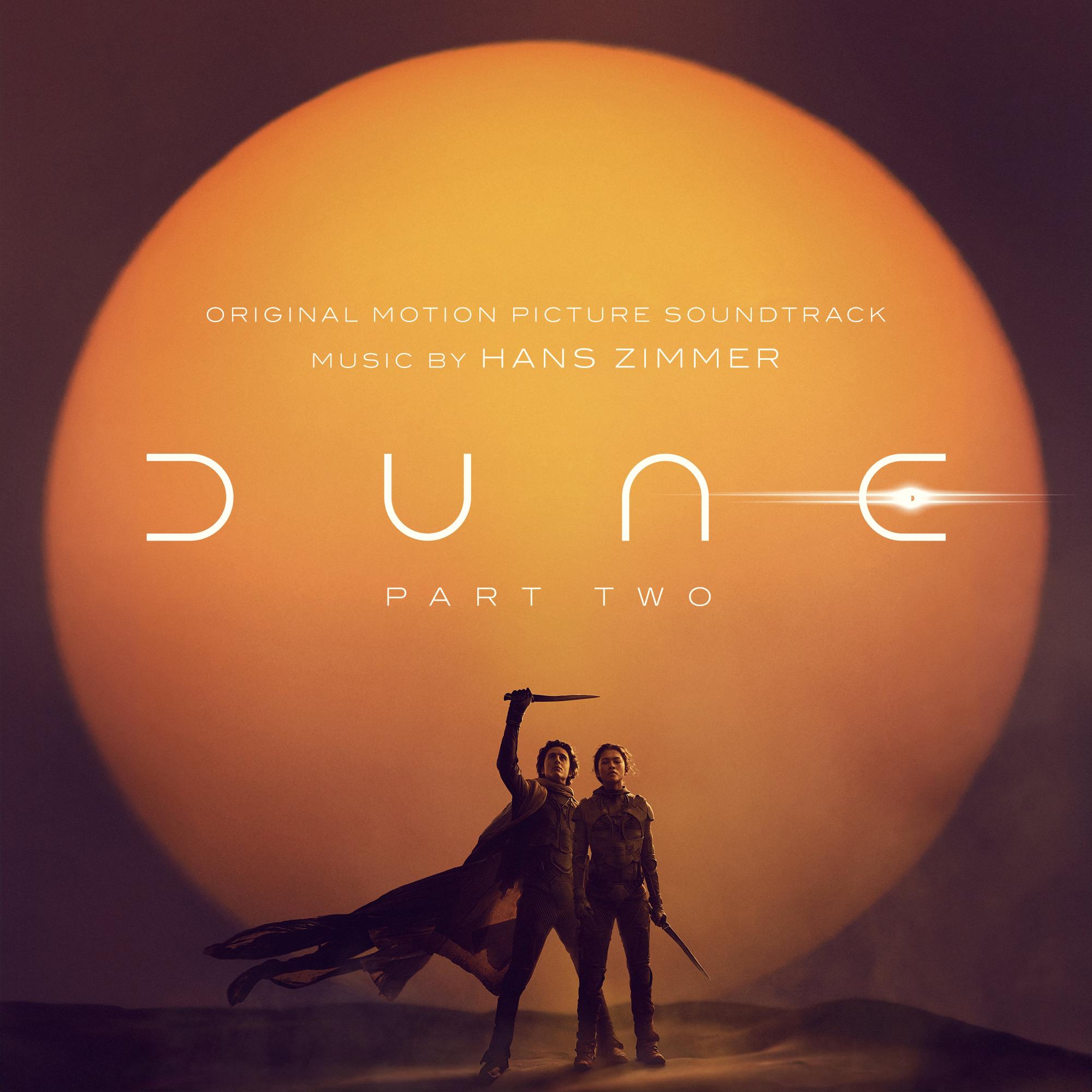
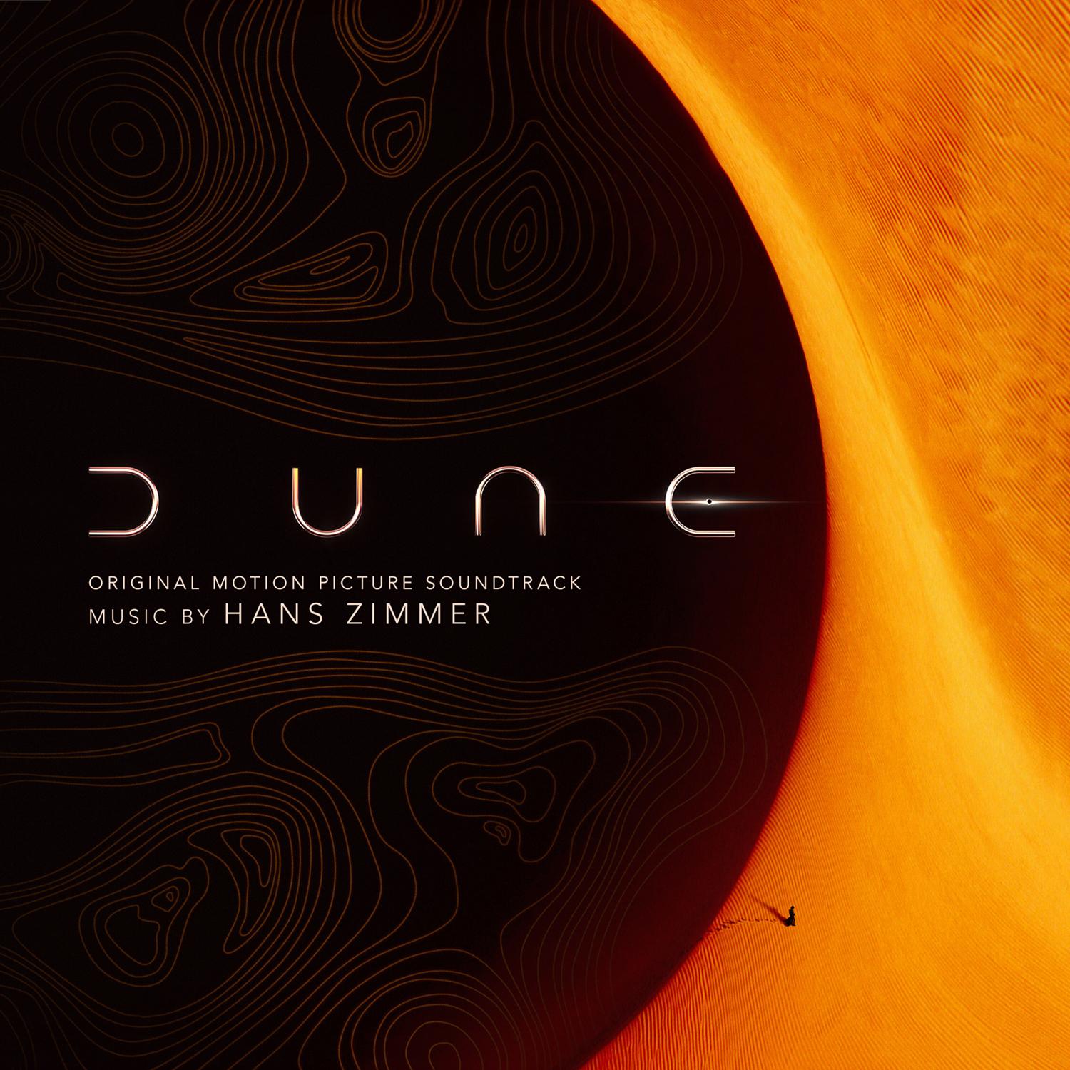
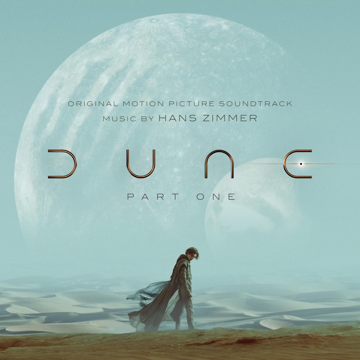
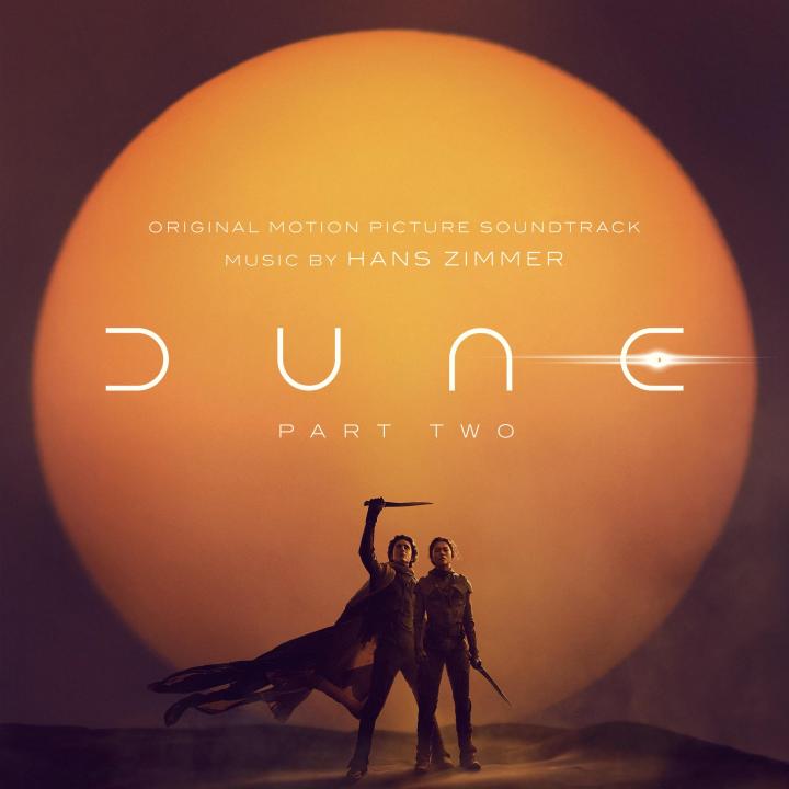
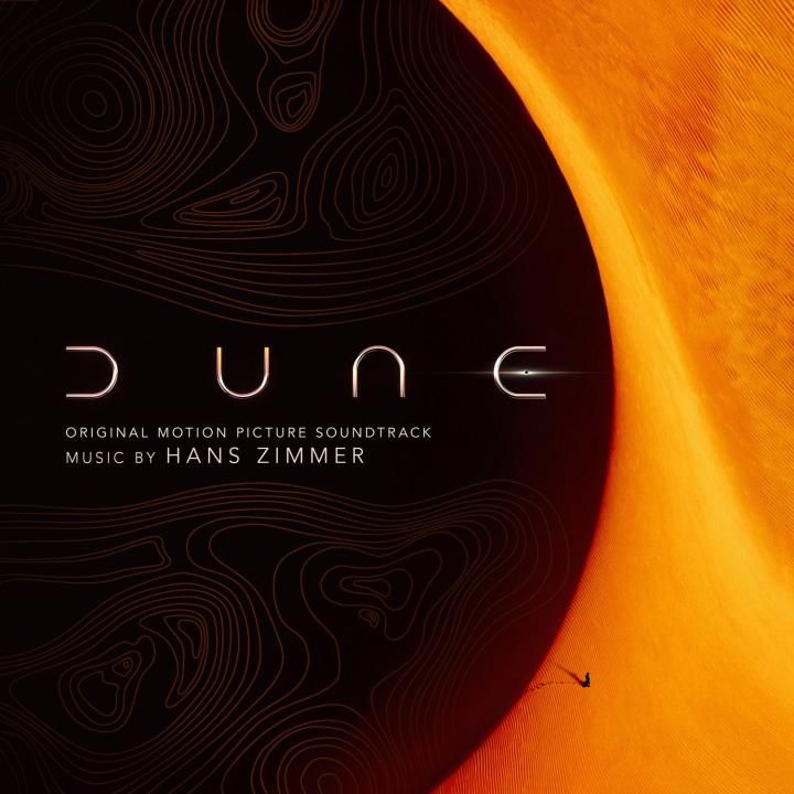
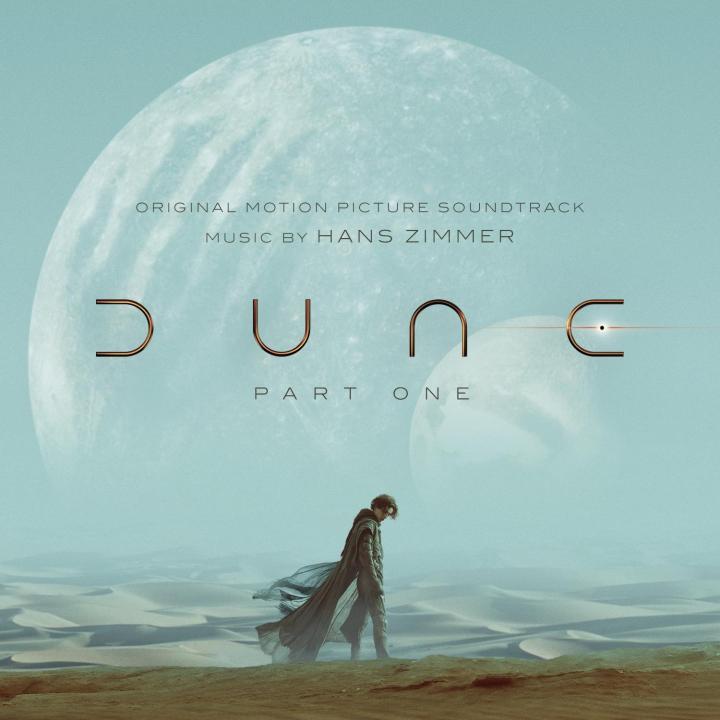
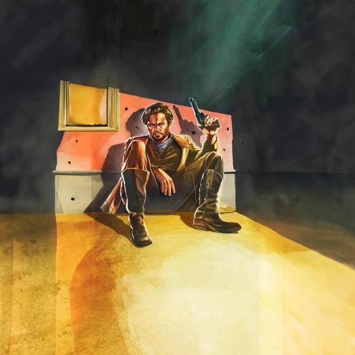
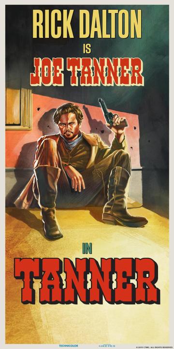
Taking my stab at DUNE
-
The BEST news! And then Interstellar on top of it! Admit it, you only chose that to be able to make the joke about the time dilation You even thought of using one of my custom covers again, I'm really over the moon. Can't wait to dive in! Thank you for being back.
-
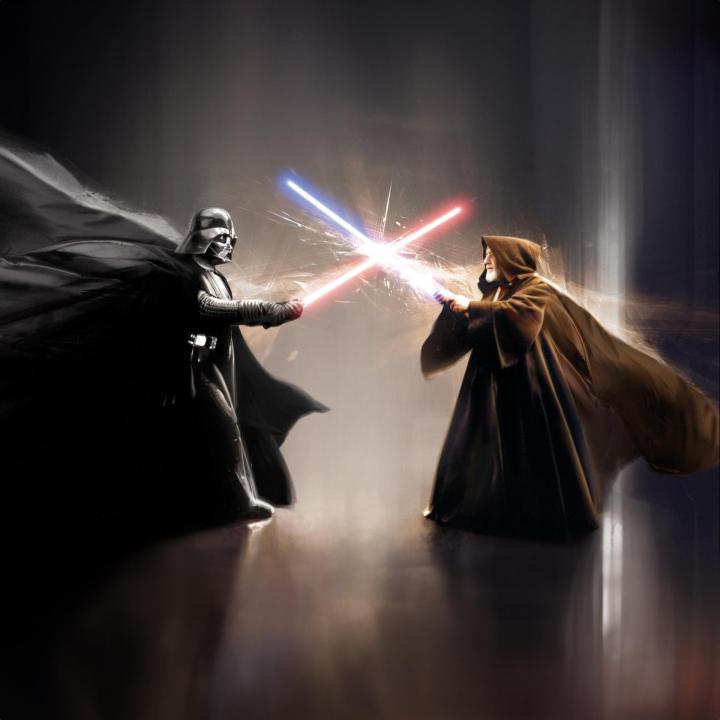
 I'd say yes, you'll probably love it. I've heard pretty good things about Star Wars.
 -
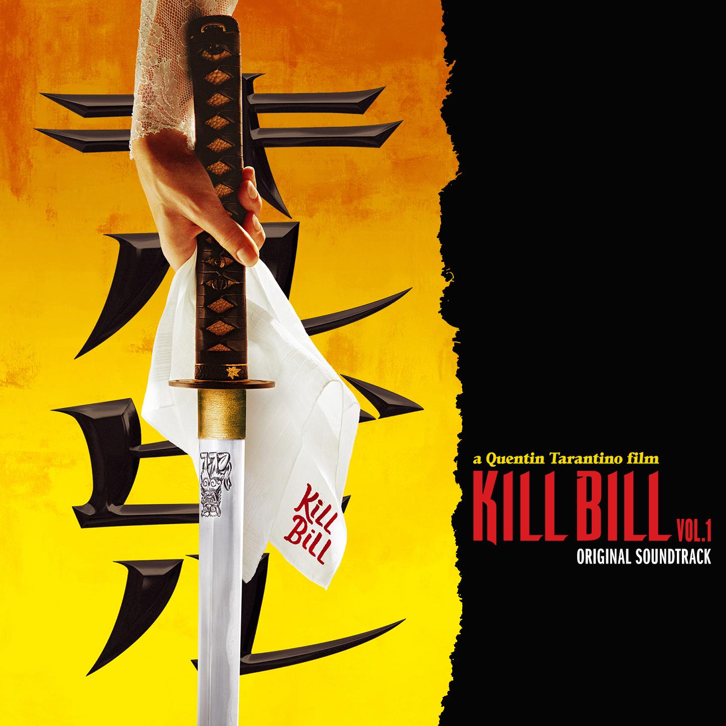
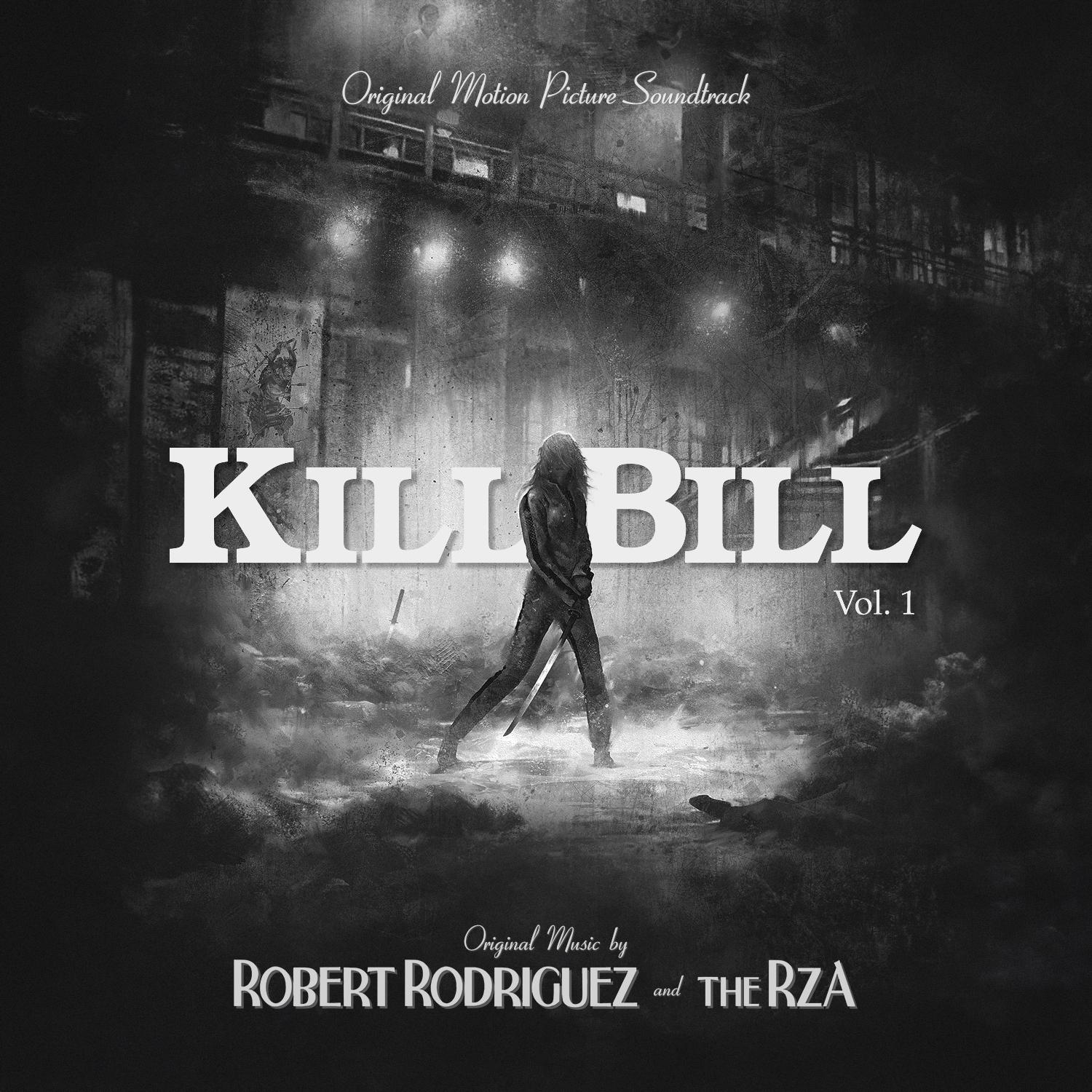
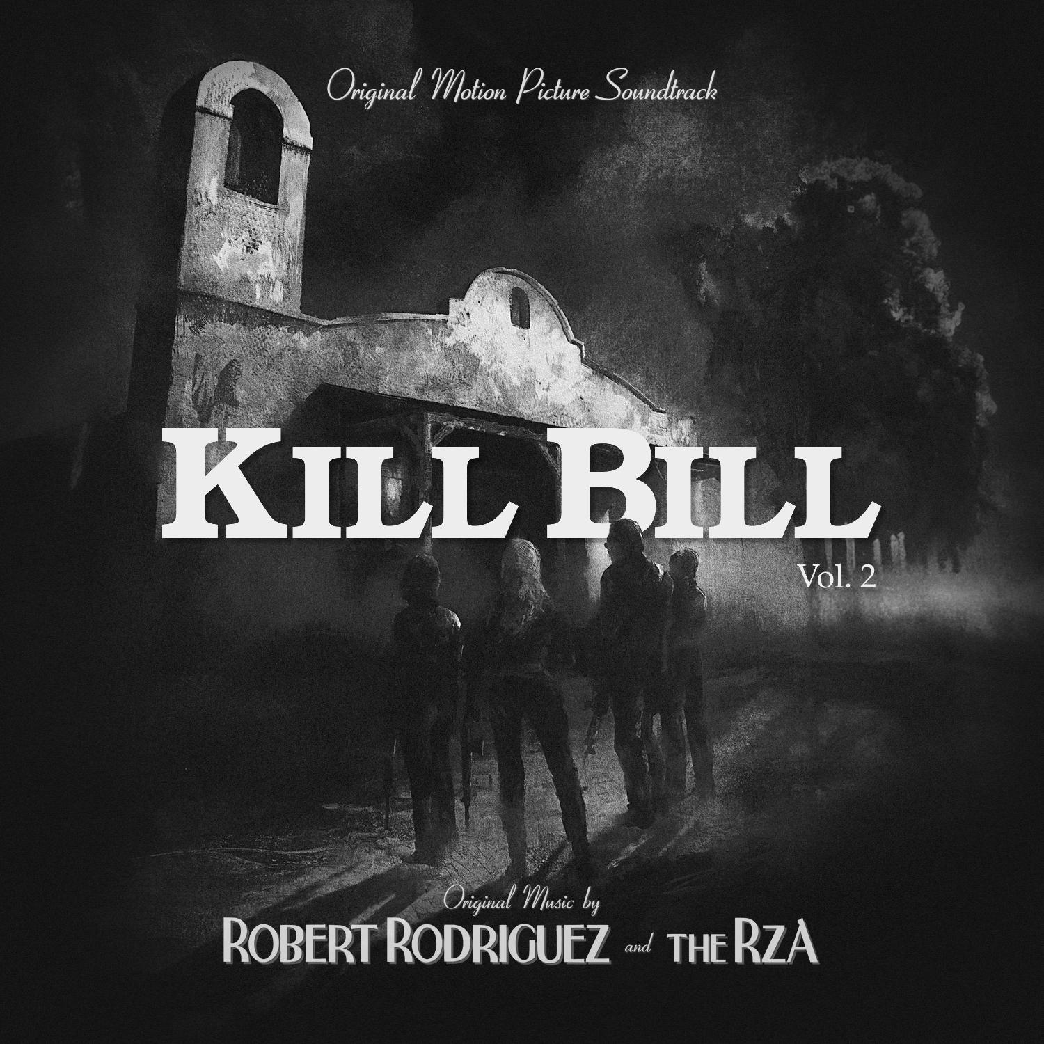
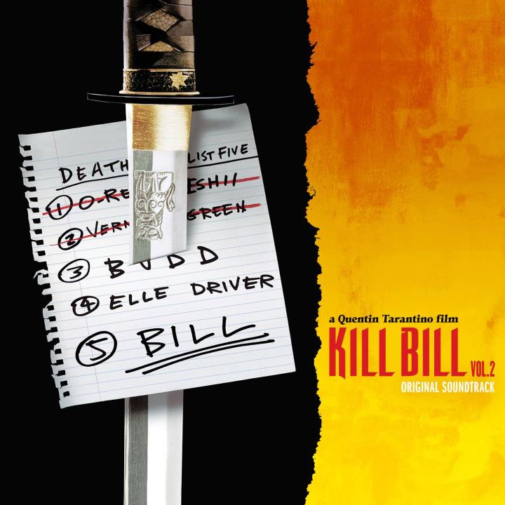
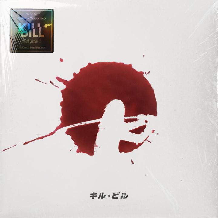
Kill Bill (Volume 1 and 2) (Sources here and here) (Source)


-
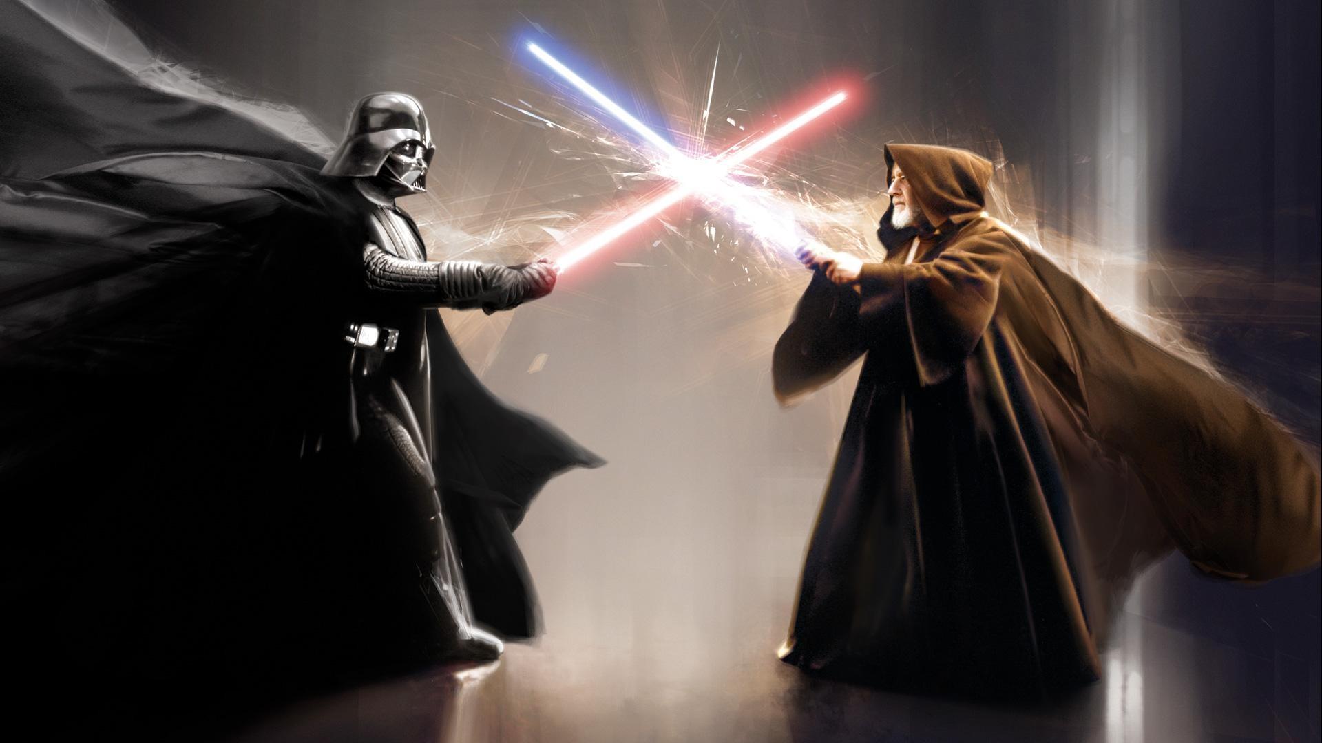
I have also started to integrate AI into my workflow and the results are sometimes really amazing. But AI is clearly not going to replace a designer; in its current state, it is simply another, admittedly very powerful tool to help you get the results you desire. Examples: Star Wars Once Upon a Time in... Hollywood The Orphanage


-
The TPM cover looks really bad when viewed full size, very pixelated. Also, I will never understand why they seem to have randomly mixed the Albertus and Trajan fonts in these designs. Also also, it really bothers me that the logos and text don't line up. At some point I really need to redo these covers....
-
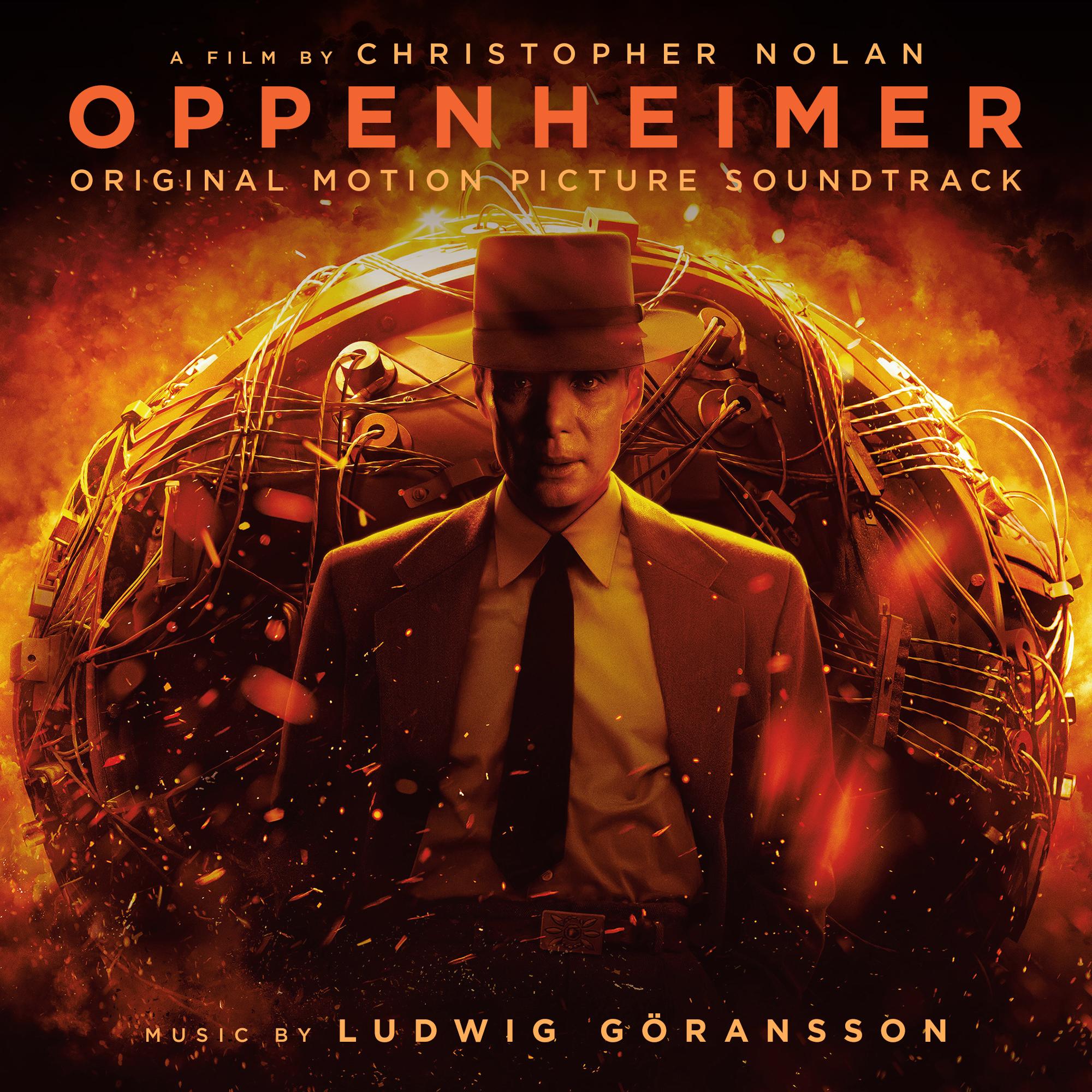
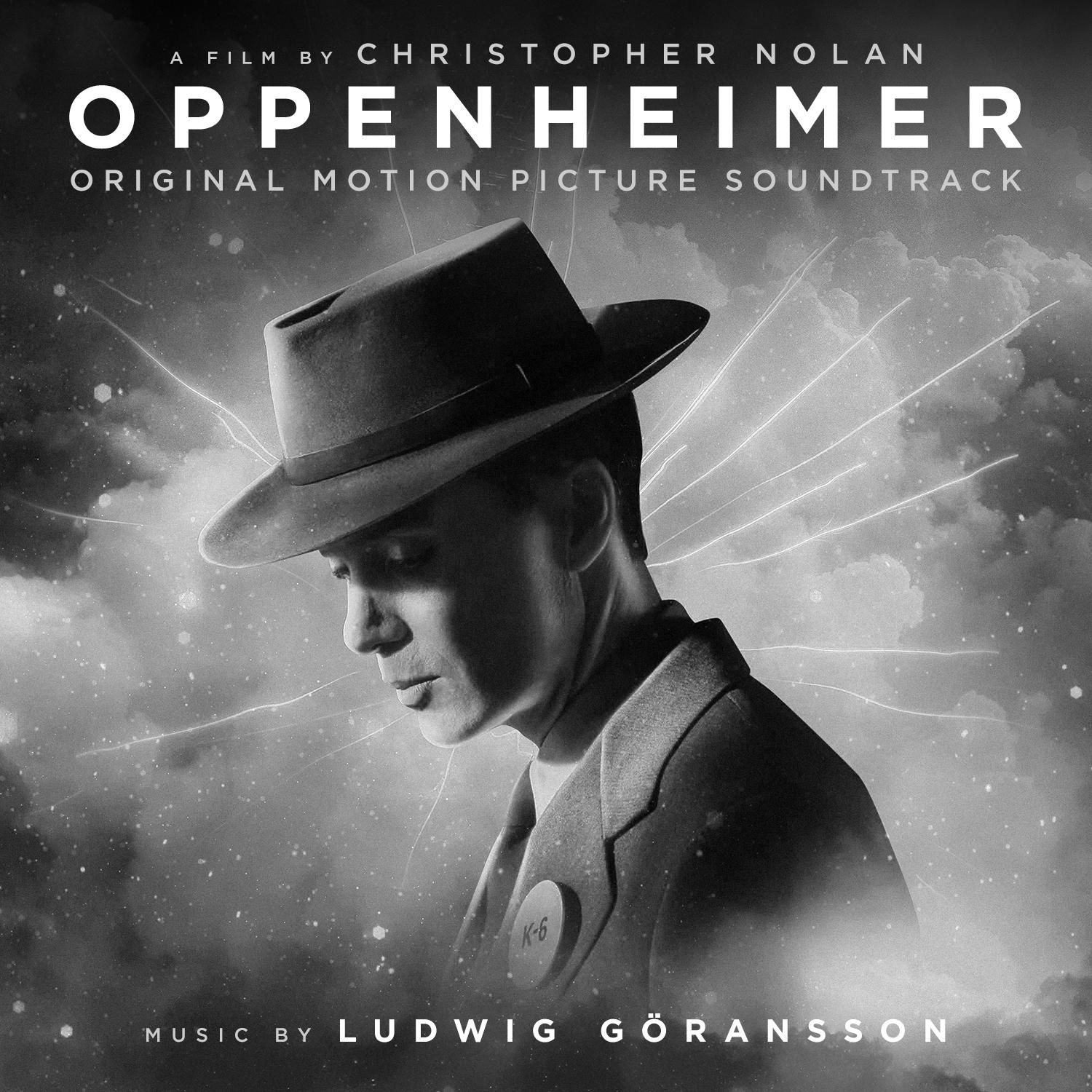
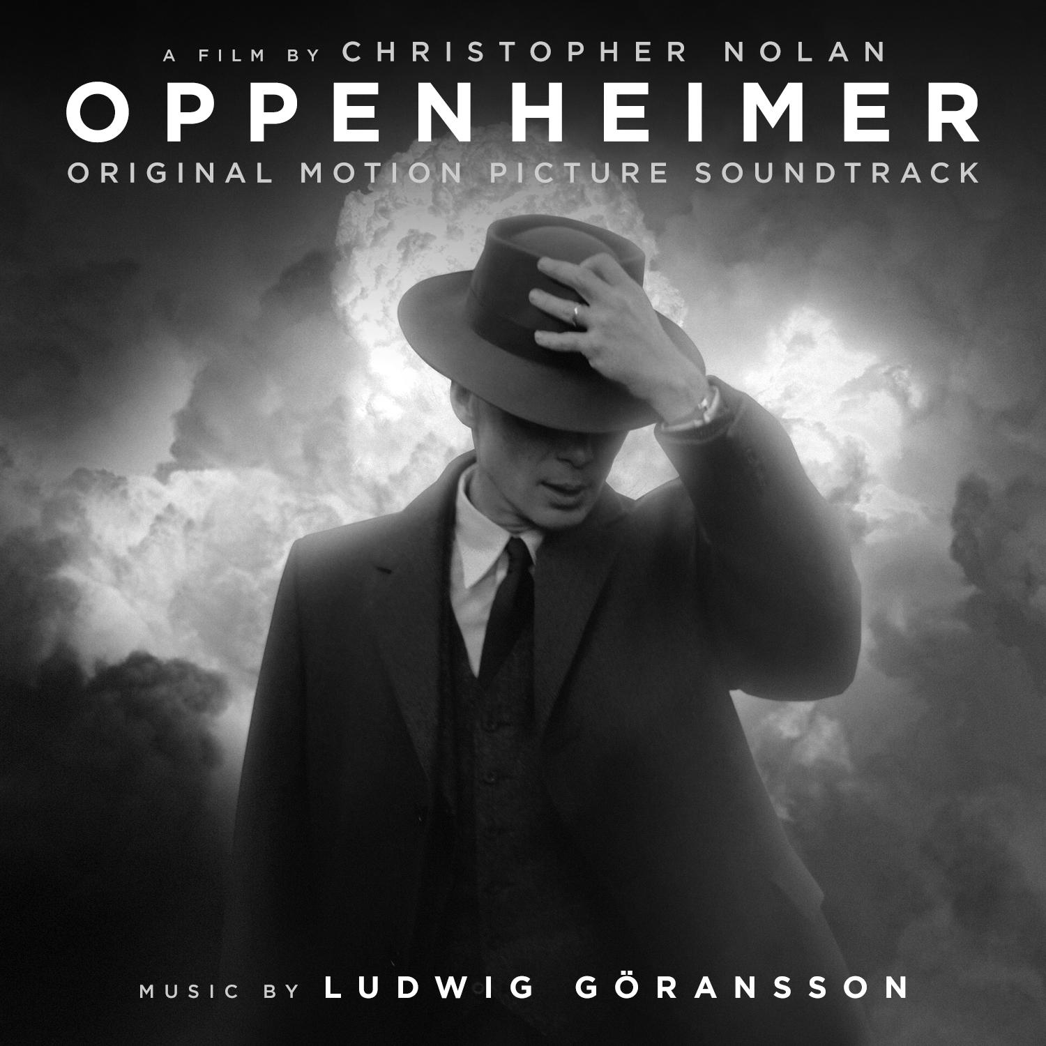
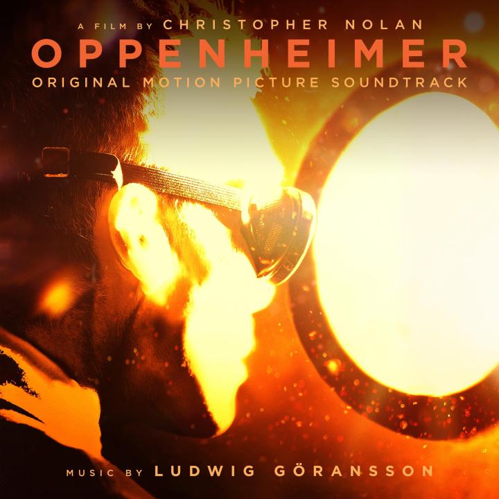
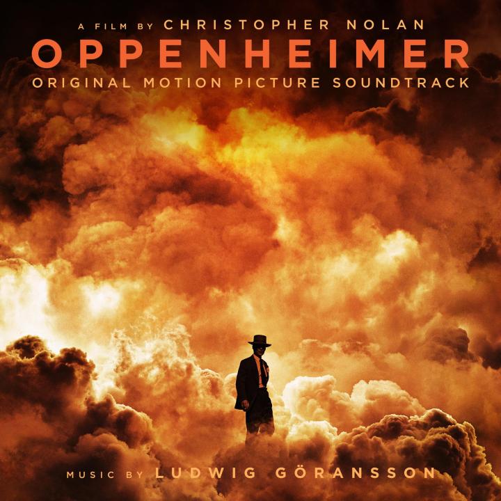
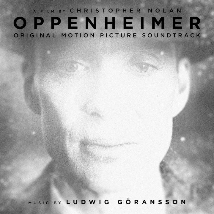
Oppenheimer Ludwig Göransson Official posters: Fan posters: Poster credits: Arvindh Krishnan William J Harris Agustin R. Michel


-
I did https://hqcovers.net/2018/08/08/the-meg-by-harry-gregson-williams/
-
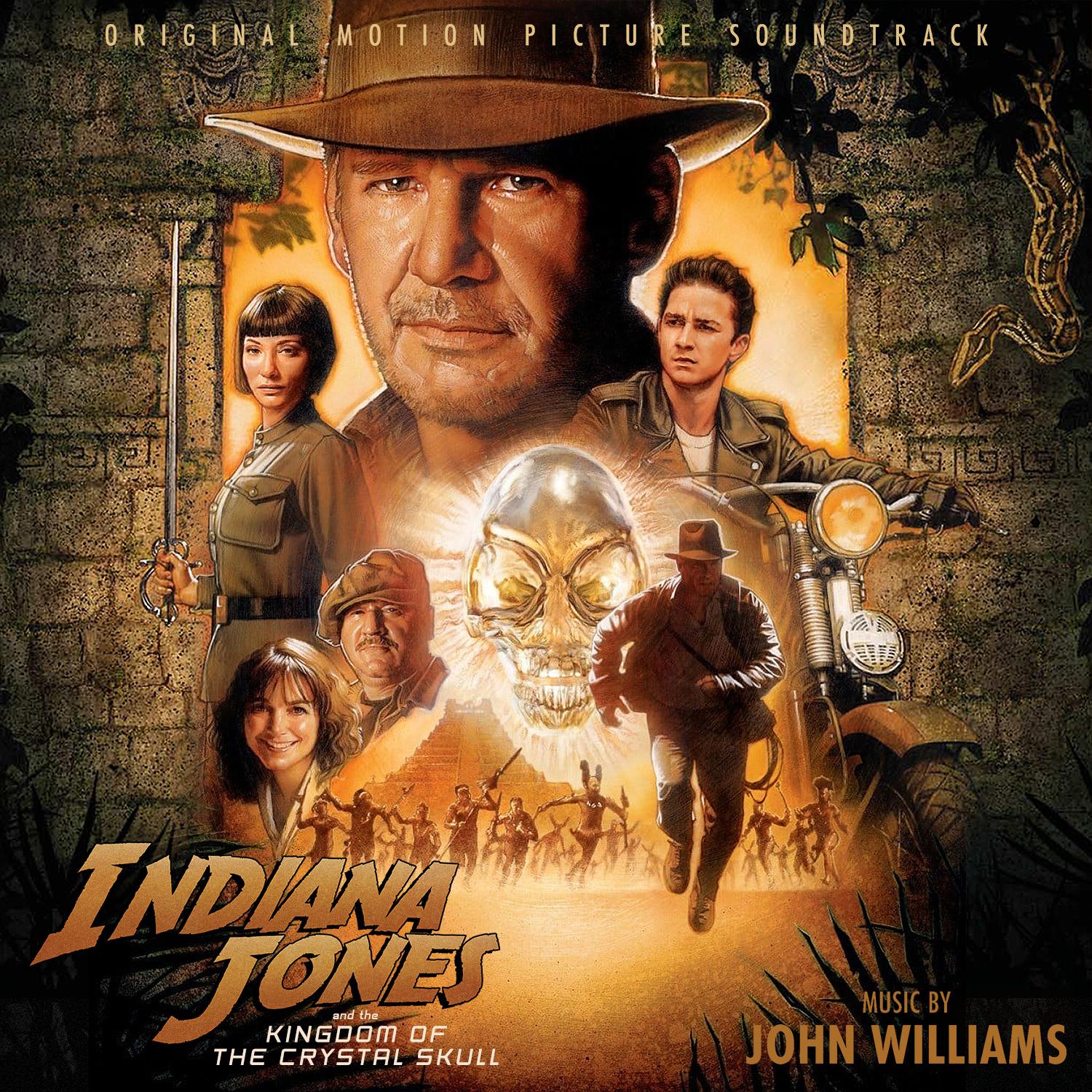
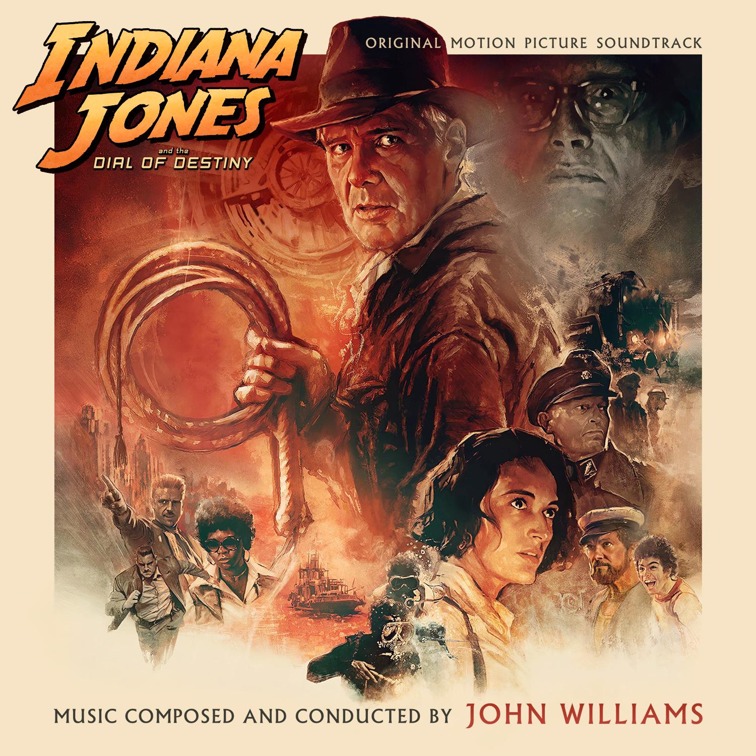
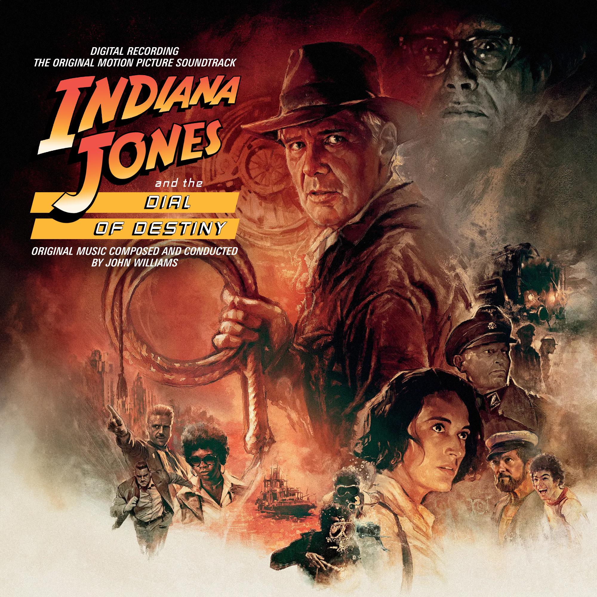
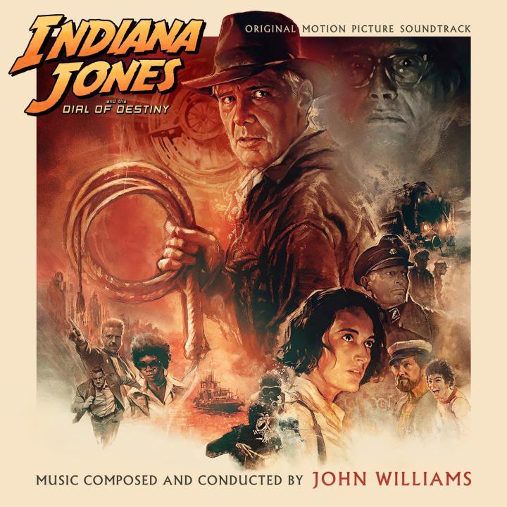
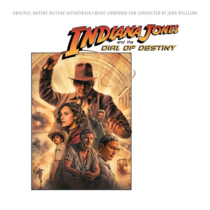
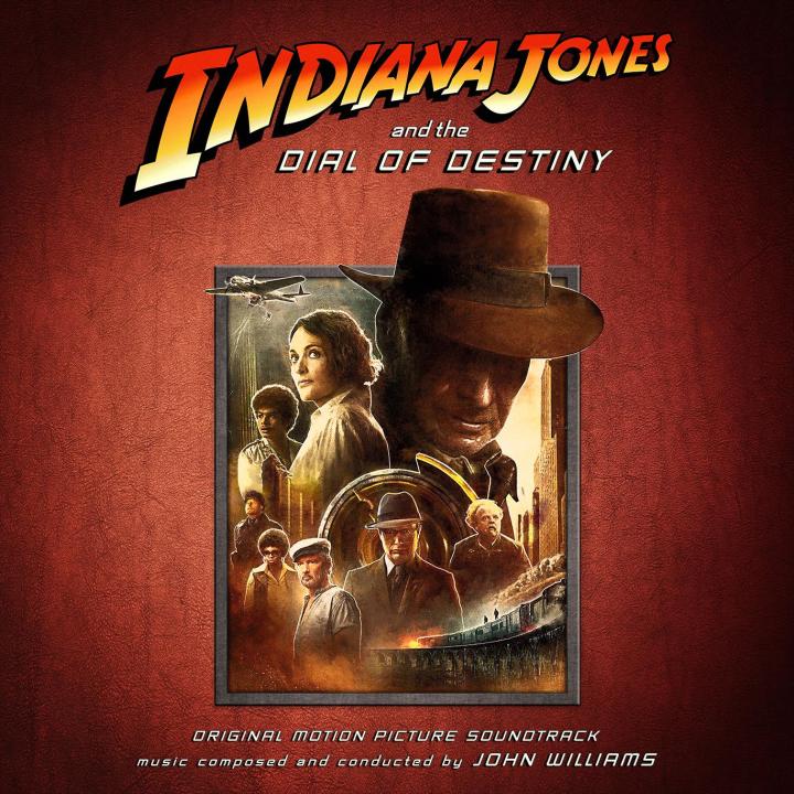
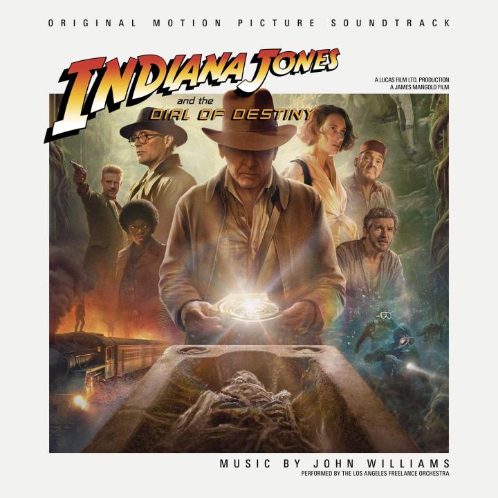
OK, so I wanted to see what the other scores would look like with the Dial of Destiny "design". It turned out.... they look like crap!


-
Nothing speak against it, if there are high-resolution images available. I'll take a look.
-
Thanks, it was you who inspired me to do it. And it was quite fascinating to see your PSD and your workflow. Thanks again, bud!
-
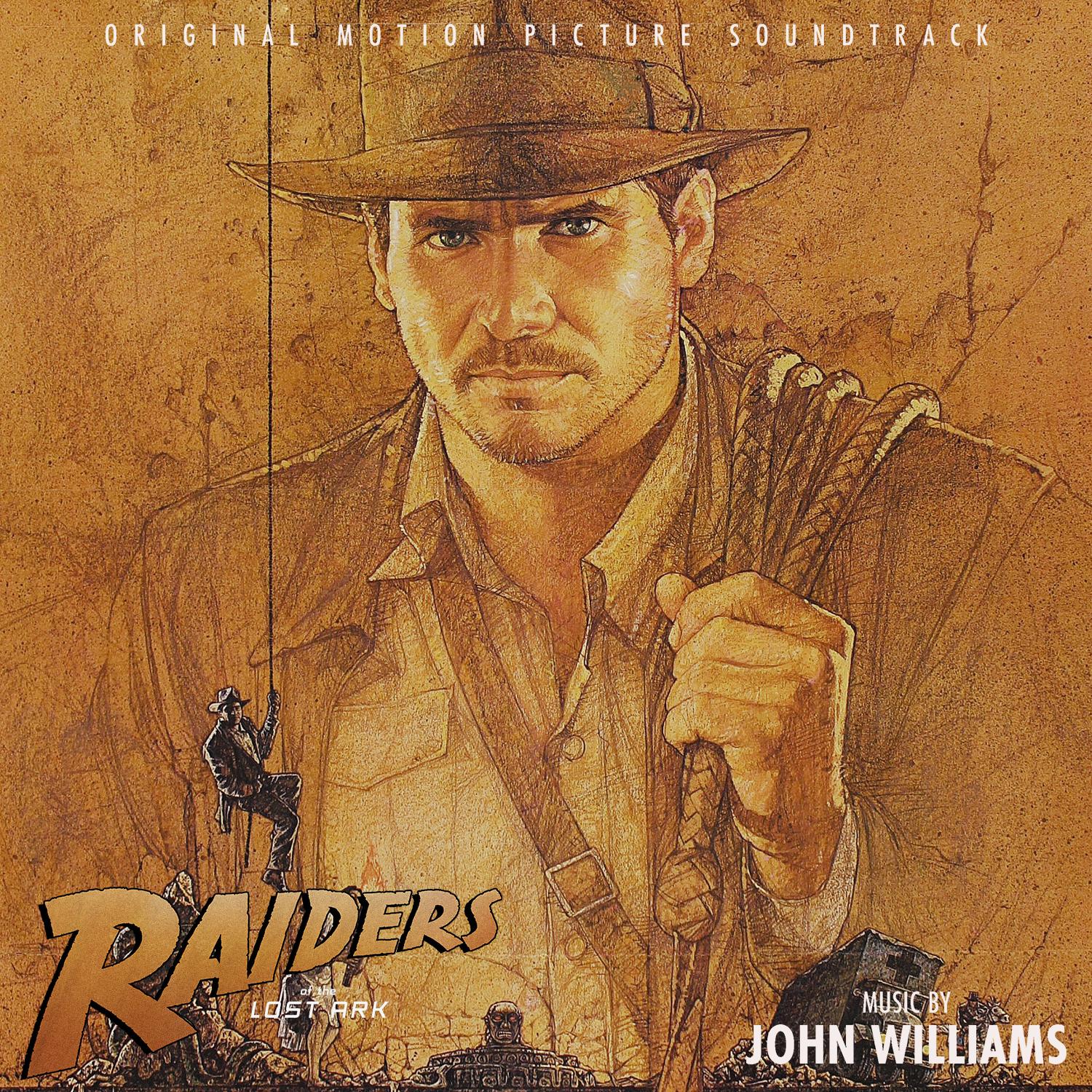
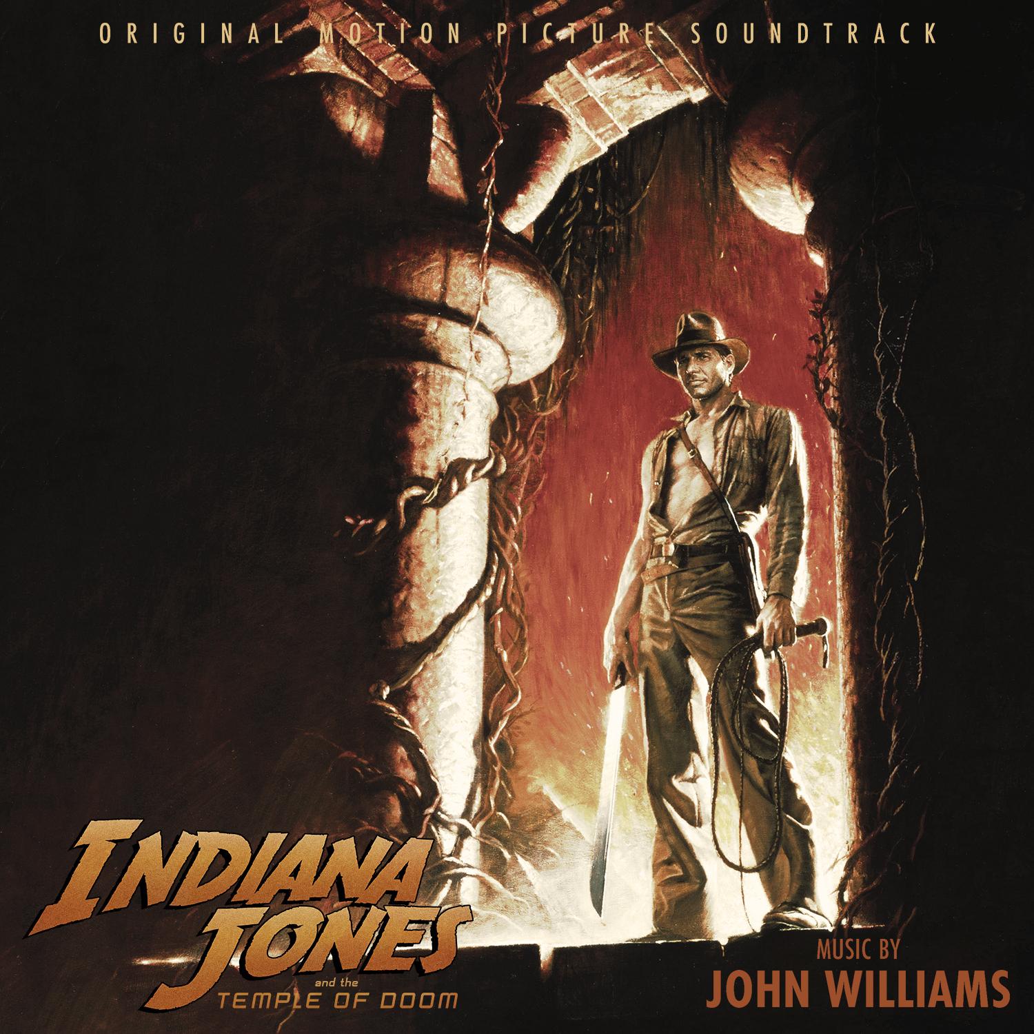
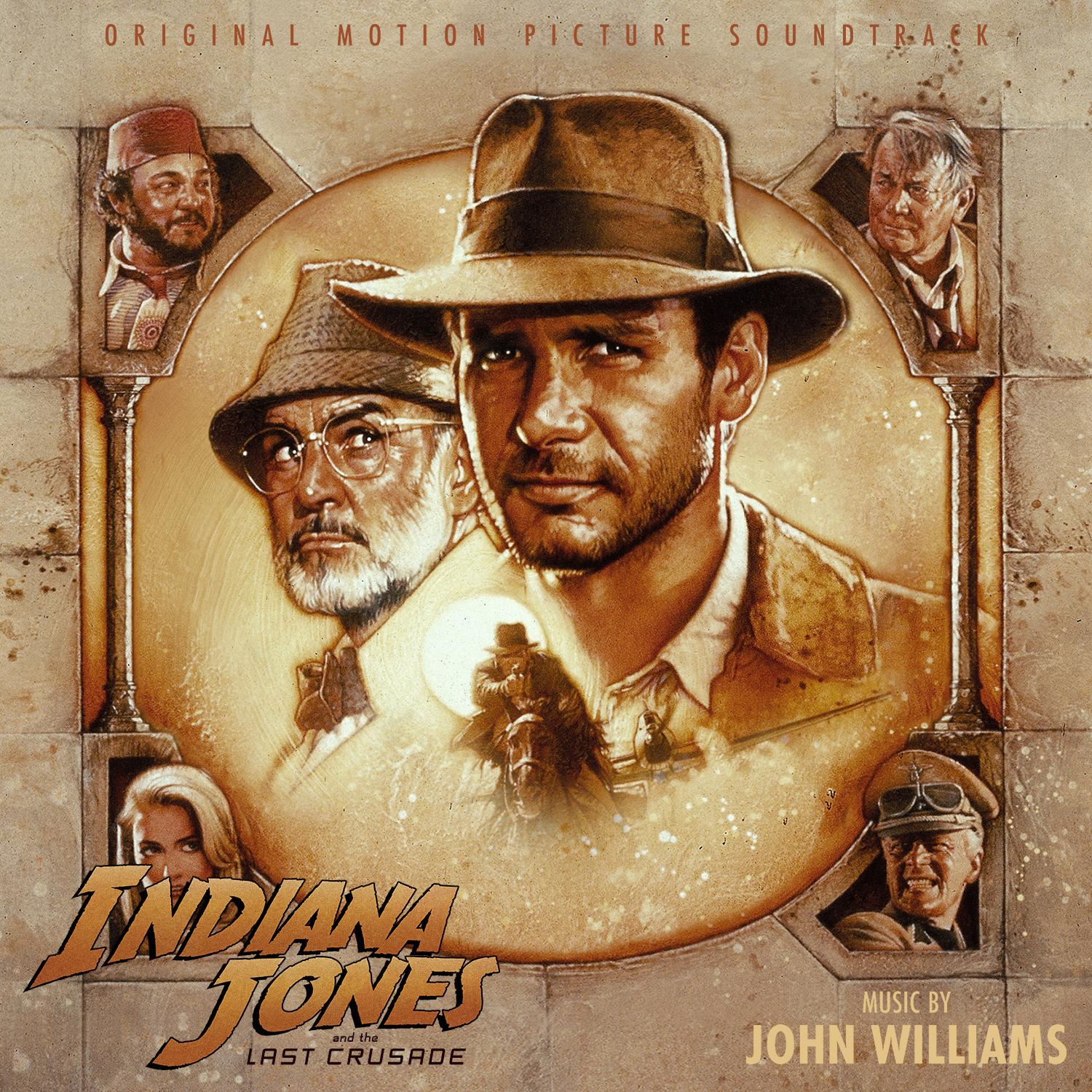
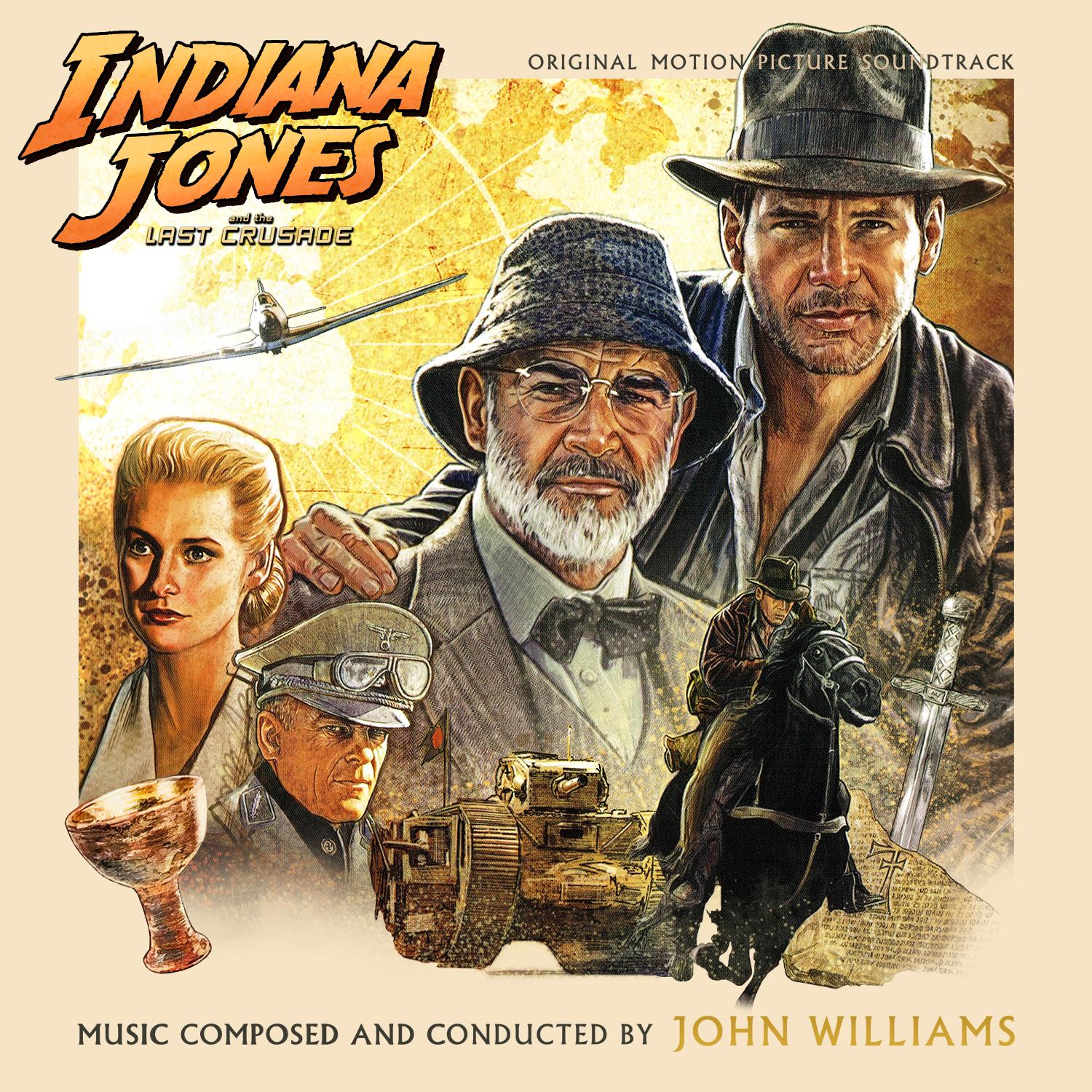
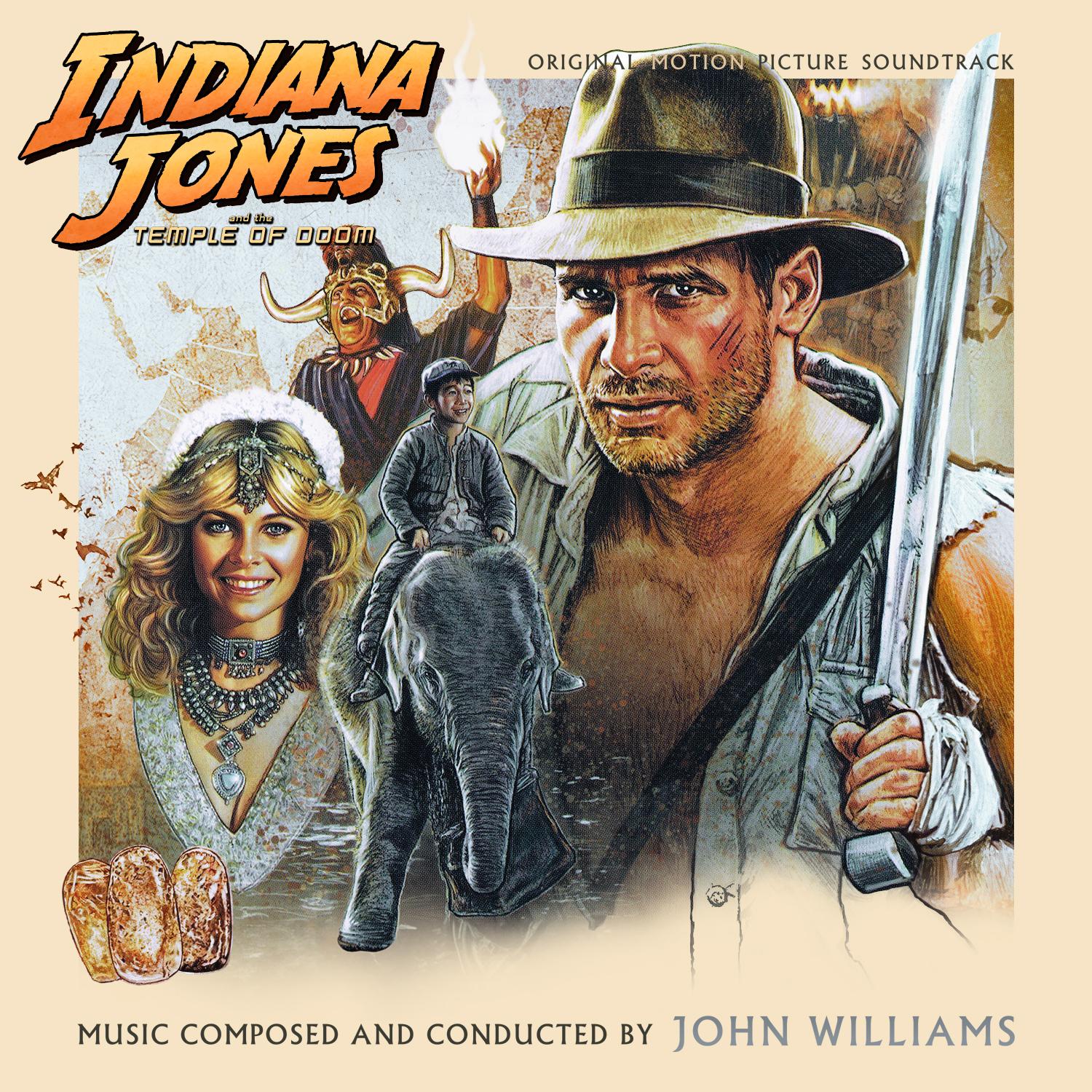
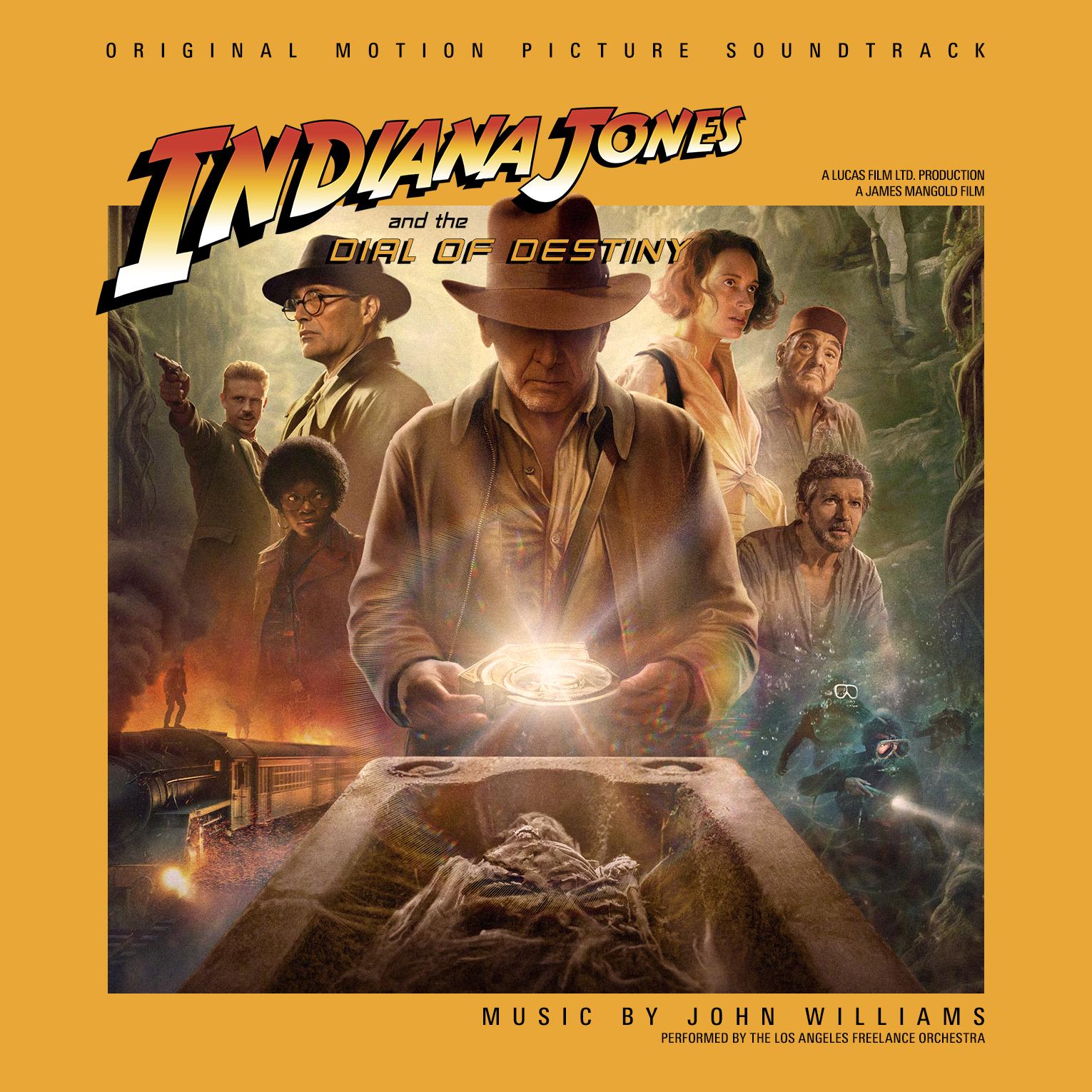
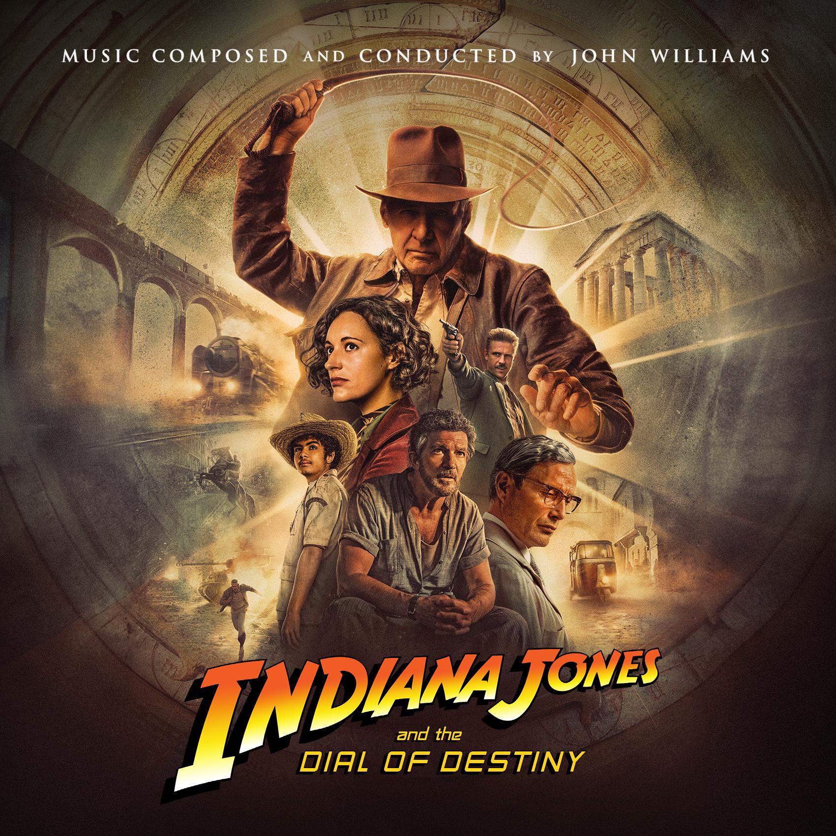
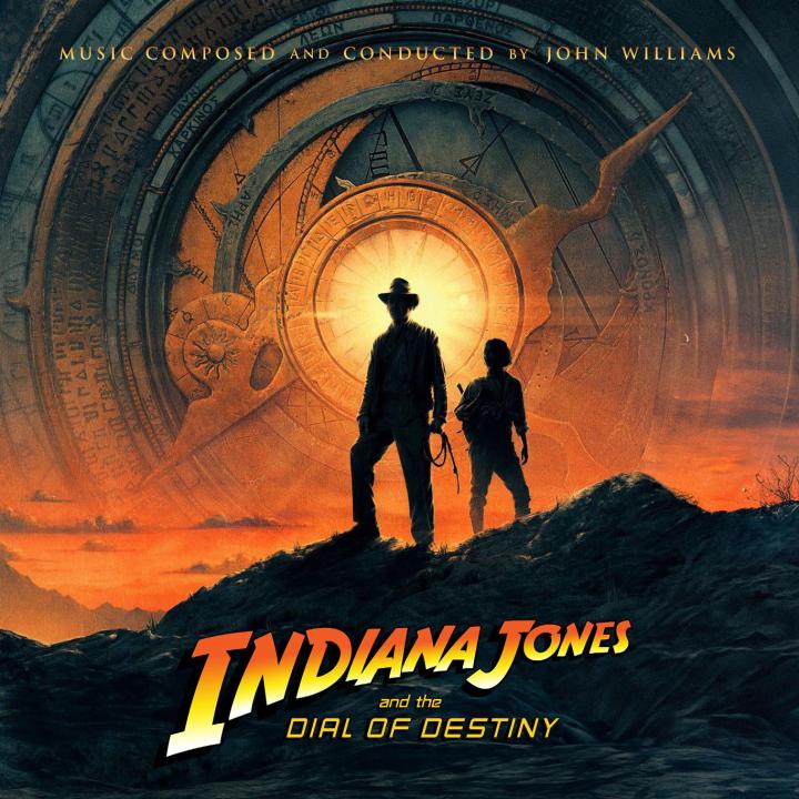
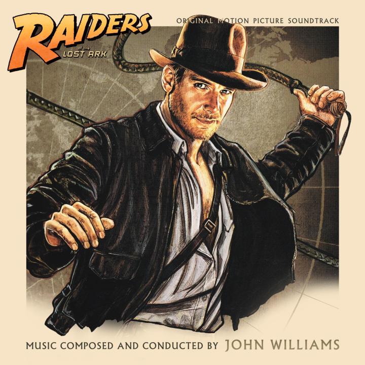
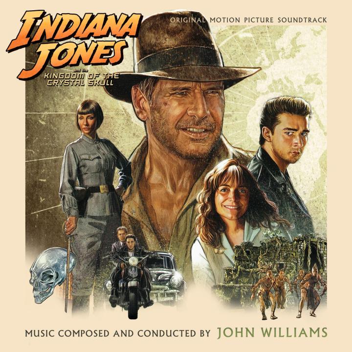
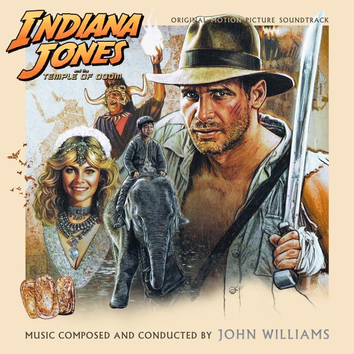
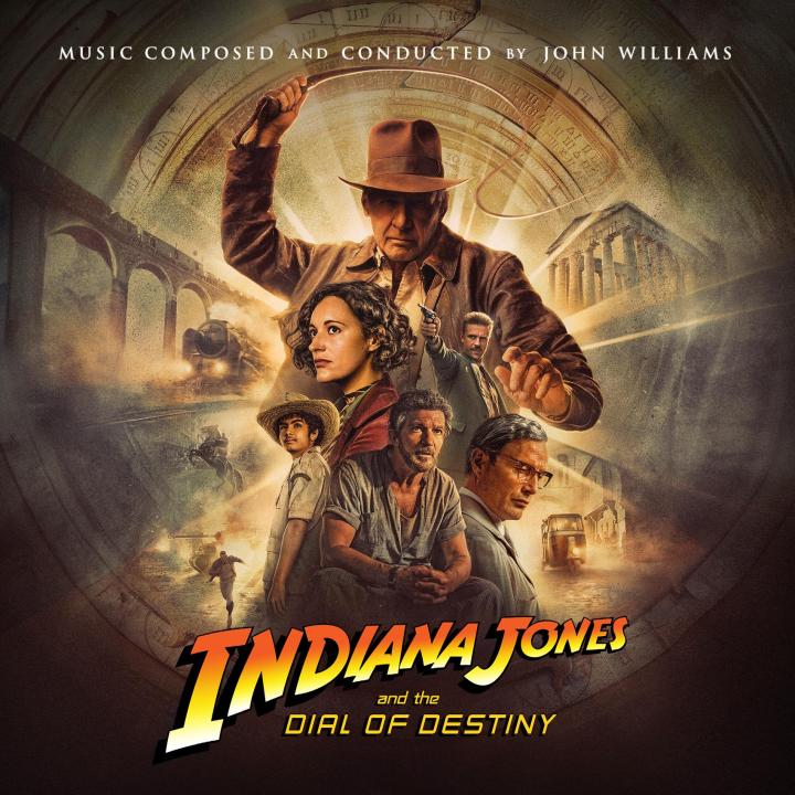
I went back over my previous "Crystal Skull"-inspired cover and replaced the official 1-sheet with the new gorgeous poster by Matt Ferguson. Also, @crumbs was so generous to let me borrow his awesome Dial of Destiny cover design to use it for 4 more Indy covers. So, to mark the occasion of a brand-new JW score, here is a completed set: (c) crumbs

-
New covers for Indiana Jones and the Dial of Destiny


-
HOLY SHIT THAT SUCKS! It's almost comical how bad this cover art is. As if the underpaid and burnt out designer said screw it and shat together the quickest and worst possible version of an album cover. And they bought it muahahaha
-
Good, good. Especially in times like these, it's important to always have a fresh Indy at home!
-
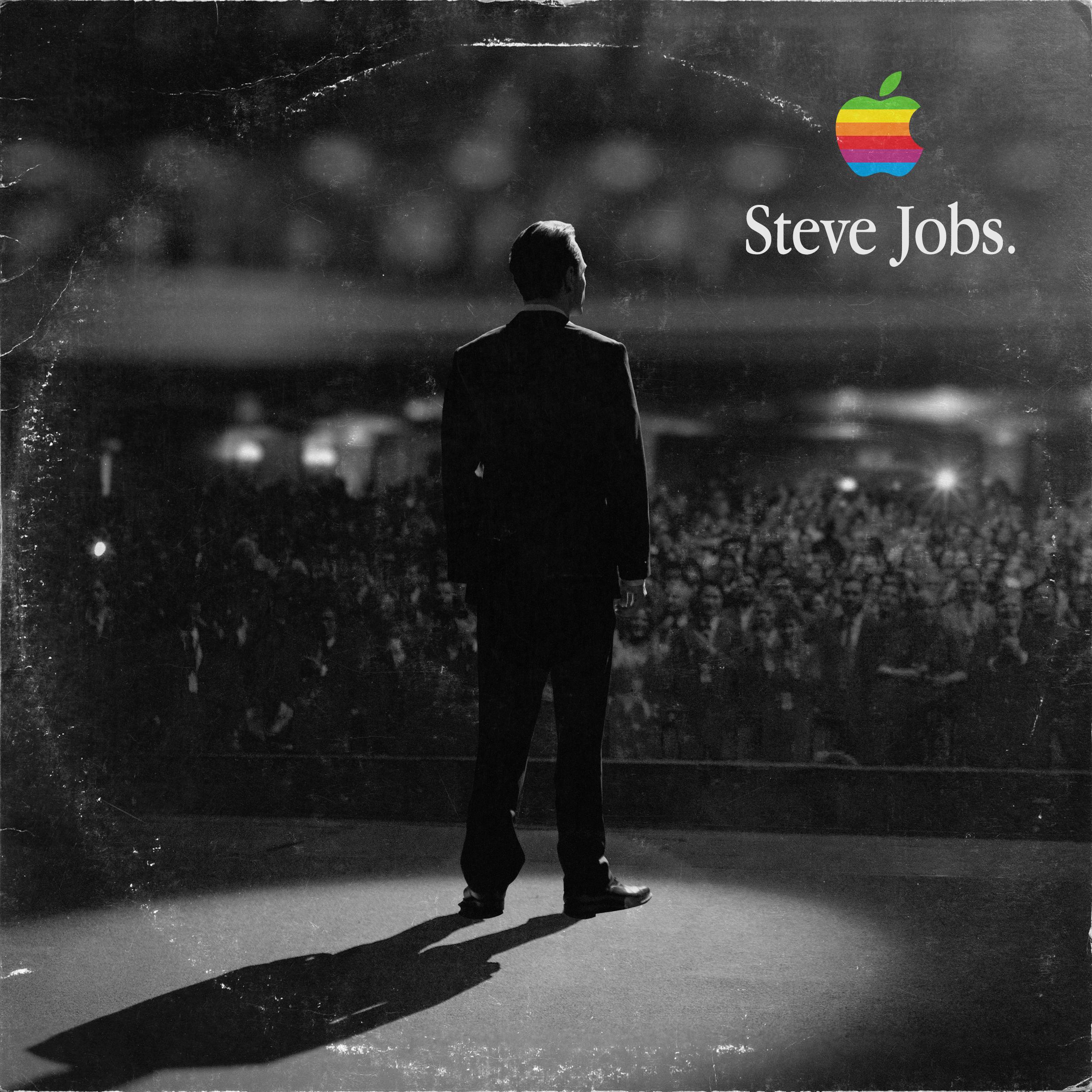
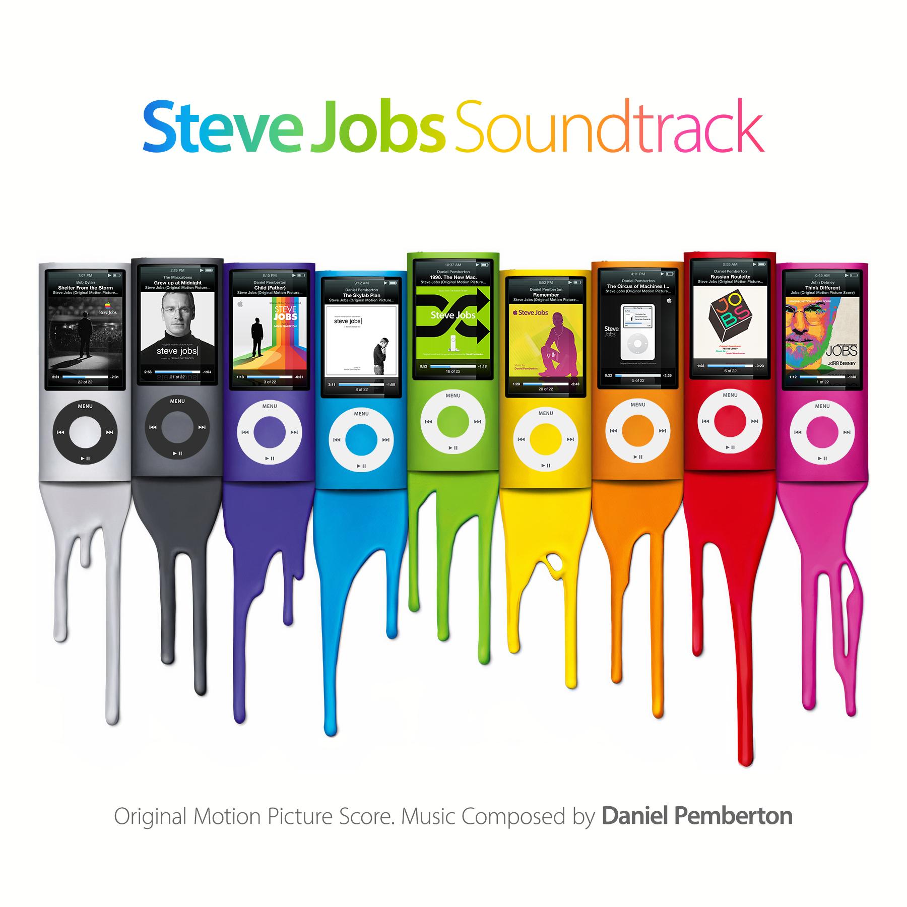
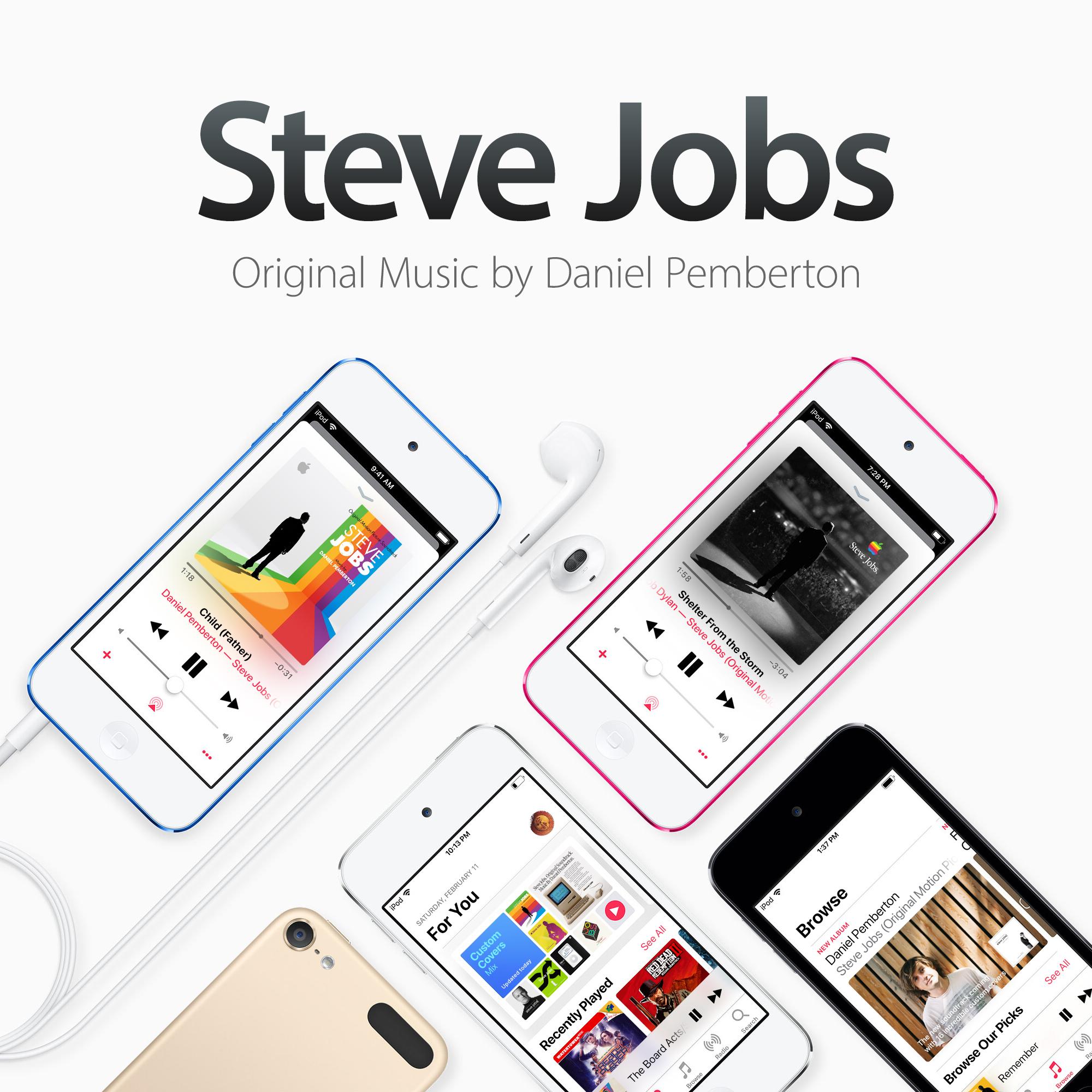
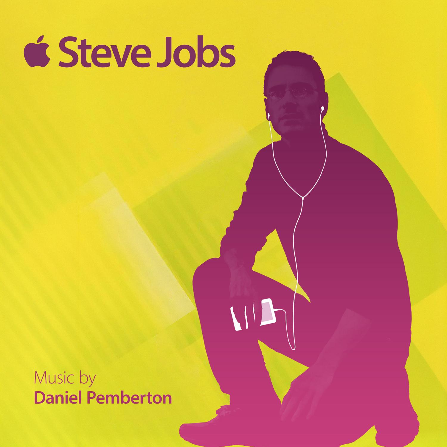
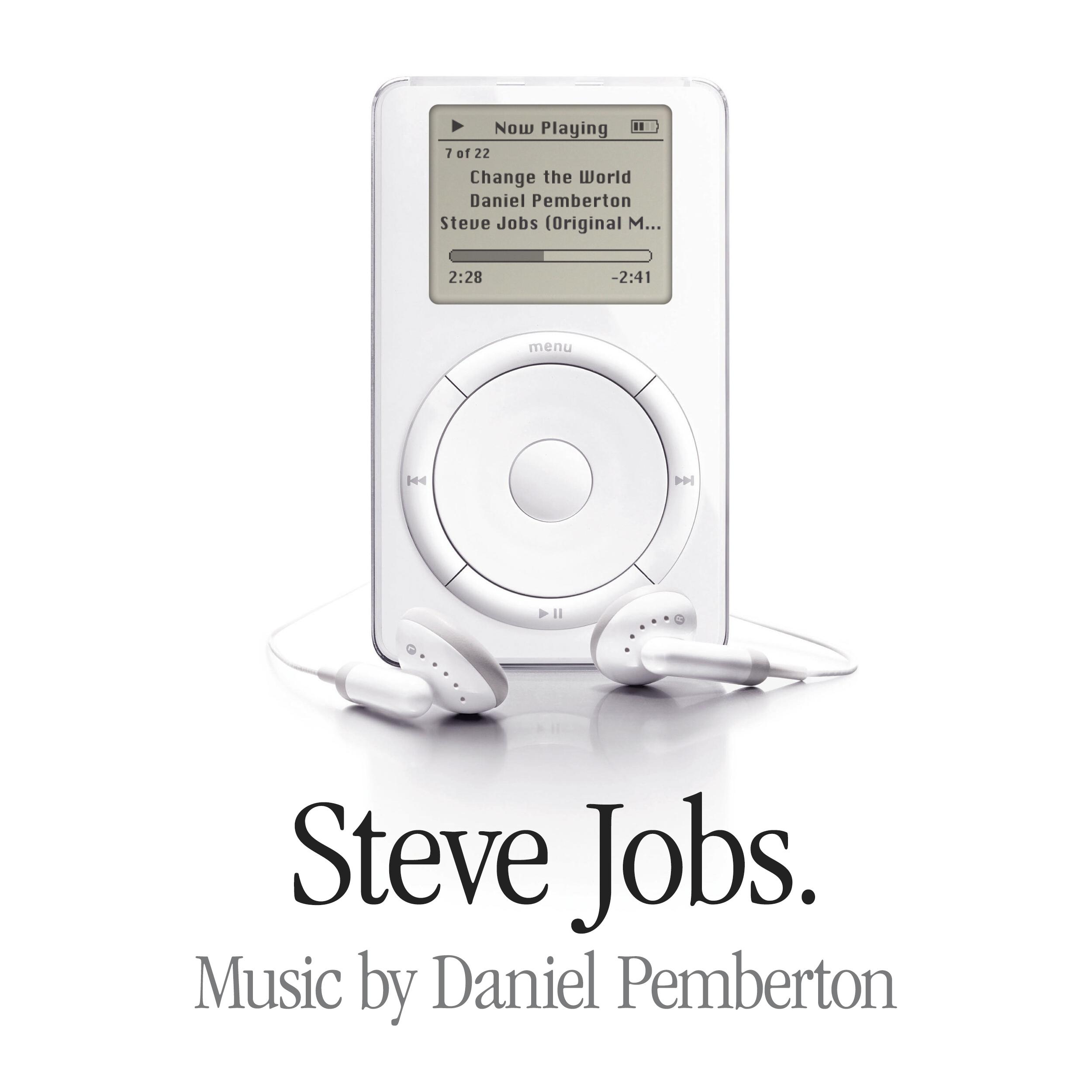
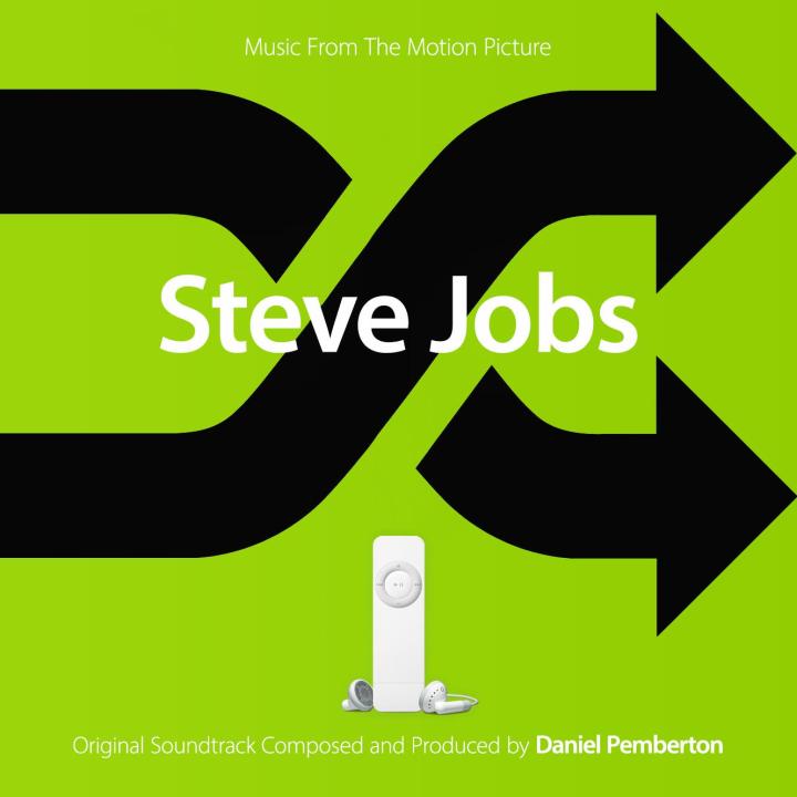
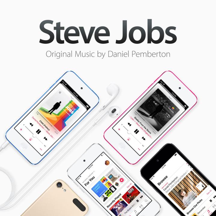
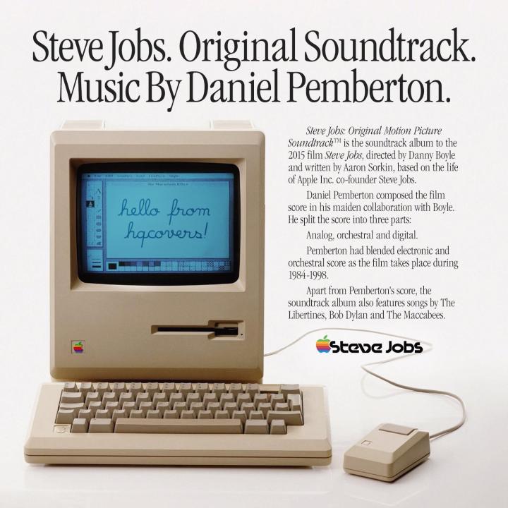
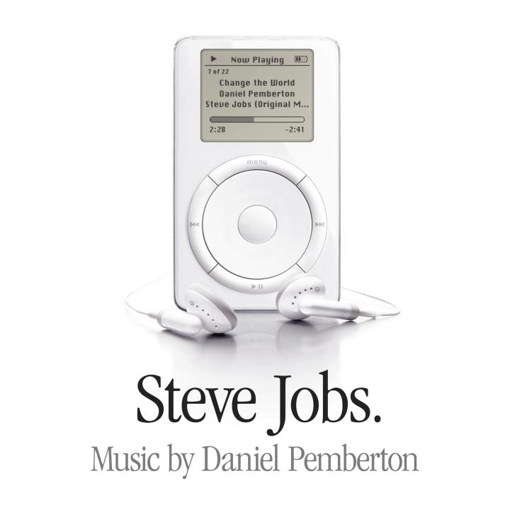
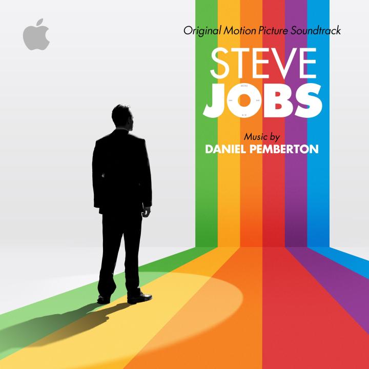
And another round for Steve Jobs (2015) Daniel Pemberton


-
Thank you I think the movie is quite fascinating and features some great performances. Yet I still think it's an eternal shame that we didn't get David Fincher's version starring Christian Bale. It could have been terrific!
-
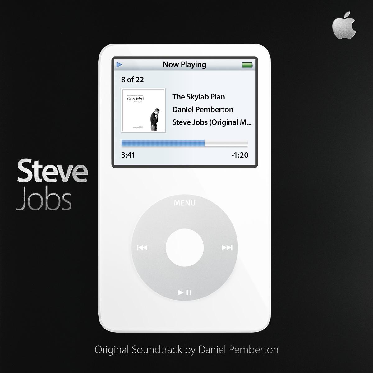
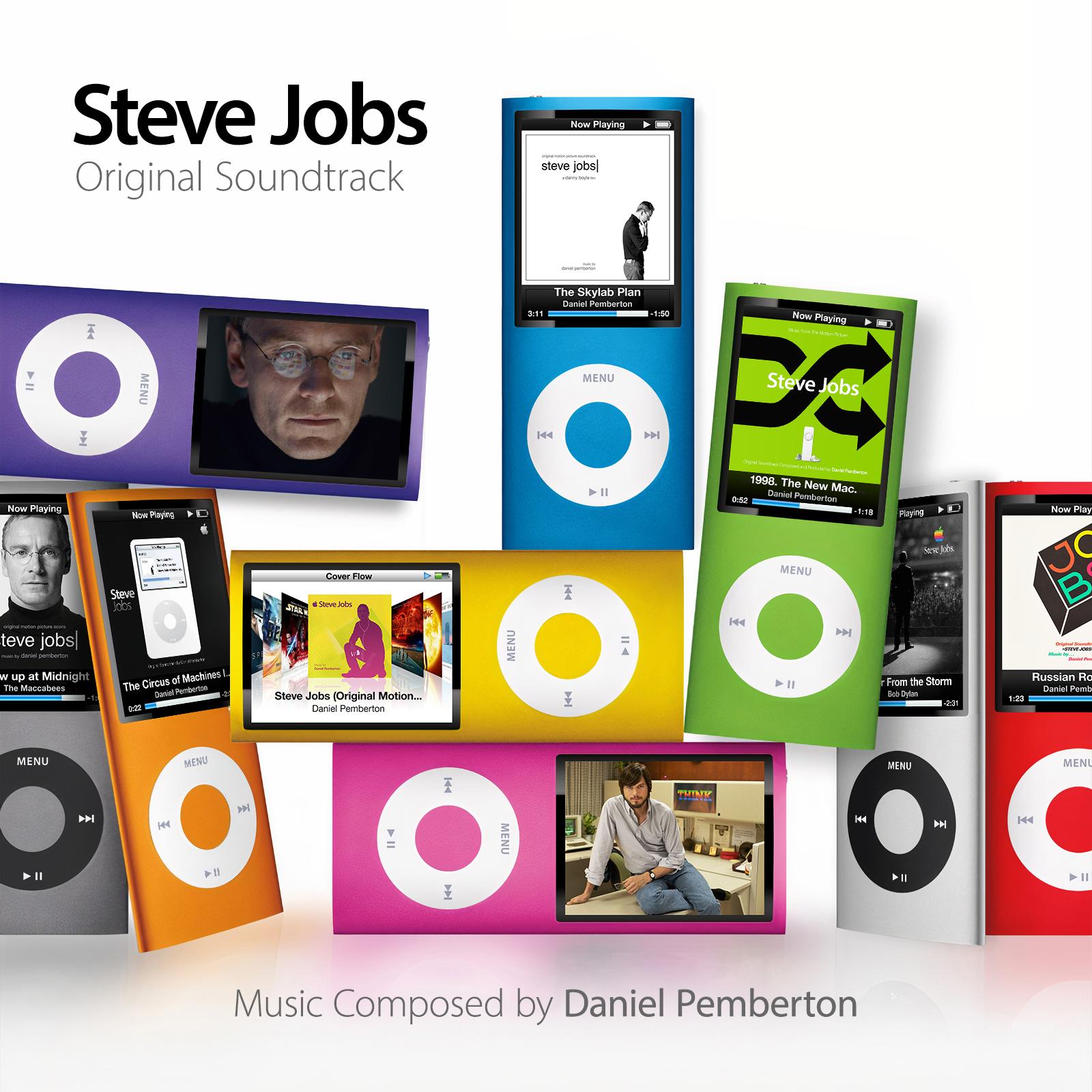
Steve Jobs (2015) Daniel Pemberton


-
I added your blog to the links section on my blog
-
I hope they paid you well!
-
Congrats on the gig! Well deserved. Did you receive any material whatsoever? Or was it up to you to look through hundreds of stock images to find something suitable? I did that once for a commission and it was hell!
-
Sta.sh Uploads 70 - anakin022's Sta.sh
-
Hijacking this thread.... It's a real shame that there's no proper version of "Tales of a Jedi Knight" available on Spotify. Those first few notes are one of the most haunting renditions of the force theme.