Jump to content

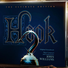
HOOK (1991) - NEW! 2023 3-CD Ultimate Edition Produced, Edited, and Mastered by Mike Matessino featuring all Williams/Bricusse songs


Jay

Recommended Posts

3 hours ago, Richard Penna said:


I'll give you (and join you) with Indy and SW.


But if you start moaning that JW's entire filmography isn't available as a super-deluxe edition, there are going to be murders :bash:


Besides, when said mythical day comes that Williams' last score is expanded... what will you look forward to? (yeah I know, that'll be in 2099 and we're all dead)


Michael Giacchino’s complete works.

Link to comment
Share on other sites

16 hours ago, Jay said:

We also made sure all 12 major themes (the six that started life as songs and the six that came after) are represented. I think every sample except Banning Back Home and The Lost Boy Chase feature at least one of the score's twelve themes. 

So...

PLnV09V.png

Would any enterprising scholars of this score help with identifying them in the samples?

Link to comment
Share on other sites

For me the blue cover makes perfect sense as in a way the movie like the original story plays with the idea, that all the events in Neverland are just a night dream. This is for me reflected in the cover and in that sense adresses more the adult audience and less the children taking everything for real. 

Link to comment
Share on other sites

Yes, my point was ‘why not keep the original logo’?


Of course when launching an updated product it makes sense to create something new so that it feels fresh, but It’s quite a step to go from updating/creating new cover art (which is expected) to redesigning a logo that represents a brand/franchise - beautiful as it may be.


I certainly don’t mean to knock Jim Titus’ work or anybody else who worked on this project - the design is beautiful - I’m just curious.
 

Thanks for doing the mock up @Groovygoth666. I’m guessing something similar was on the table during the design process but was abandoned - it’d be fun to hear the reasoning behind it.

Link to comment
Share on other sites

2 hours ago, Goldfingers said:

What's wrong? It looks perfect. And maybe it's with printed effects like gold effects that can't be rendered in the digital version of the cover. Wait until you have the product in your hands to judge anyway.


Nothing is wrong - I stated many times that the new ‘ultimate’ cover is beautiful. Possibly, what you interpret as “wrong” is simply curiosity about the design process. I would have hoped that that came across, but apparently not. Here’s hoping to clear up any misunderstanding.


Unless I’m looking at the wrong link, it’s clearly not the logo in the teaser trailer.


Screenshot:


IMG_6938.png
 

2 hours ago, Goldfingers said:

When most of the stuffs have the same visuals for a movie. It's normal to try to find news and originals visuals.


Visuals - yes. Logo - no. It was more common to use different logos/fonts/colors in the 70s and 80s and possibly the 90s… actually the yellow Hook logo on a local/foreign market poster is a good example of this. It’s the kind of thing you rarely see today. Of course this was a time before branding and building global franchises had become the full fledged refined science that it would - but today the standard is to try to contain brand consistency. And a side step from that practice is curious to me.


A logo is the unique signifier for all that a brand stands for and is not lightly tampered with as it is the “flag” for the brand it represents. So changing or updating a logo is very rare, unless we’re talking about a re-branding, a modernization or a spin off, where it’s usual to tweak the original logo a bit to make it feel modern and appealing to a new audience.


2 hours ago, Goldfingers said:

This logo is the original logo, mostly used in the prologue teaser and teaser posters (on Alvin artwork, blue sky background or black background). This is (to me) the best version and its elegance fit to this edition.
Jim reworked it a little to make it sharper and it look perfect to me.


If you are referring to a black logo with a gold edge (as per the ‘ultimate’ edition) that was used for the original marketing during the early 90s which Him Titus might have used as reference - I couldn’t find it. I humbly submit that all I did was a couple of google searches, but I couldn’t find it. If you have an image, please share it because that would be exactly the kind of “source” I was looking for.


But just to repeat myself: I like the design of the new set from a pure design point of view - subjectively it is more appealing than reworking a 35 year old poster (but once again, I love that poster and I love the ‘expanded’ artwork).


As I have pointed out I have nothing but respect for Jim Titus, which was mentioned not only in the previous post but also in many posts throughout the years. My point now was to scrutinize the new cover from a marketing/branding point of view.

Link to comment
Share on other sites

Spectacular! I'll have to wait for JP, TLW, Sabrina and Hook to be available at the same time.


Quote

02. Home Run And Follow That Shadow 5:24
03. Peter Remembers (The Flying Sequence) 8:23
04. You Are The Pan (Film Version) 1:26
05. Tink Grows Up 2:21
06. The Ultimate War (Film Version) 8:02
07. Death Of Rufio 4:23
08. The Sword Fight And The End Of Hook 7:07
09. Farewell Neverland 10:18

I once edited the cues of the bootleg together and ended up with the exact same track combos. Thankfully, this 3-disc-set makes any bootleg obsolete!

Link to comment
Share on other sites

9 hours ago, rough cut said:

All in all, I’m a little bit on the fence about he ‘ultimate’ cover. On one hand, it’s gorgeous to look at, and really appeals to my sensibilities in terms of artistic choices. From this subjective point of view it is an improvement over the ‘expanded’ cover. On the other hand, perhaps it strays just a little bit too far away from the original source material.

It is kind of a statement to go from such a busy to such plain artwork, maybe it is supposed to make the two releases easily distinguishable. A statement à la "This is not a re-release, this one's different."


3 minutes ago, Jurassic Shark said:

I usually pass on the first pressing in case any fuckup in quality control...

La-La Land hasn't really had any of these fuck-ups. It has mainly been Intrada and Varese.

Link to comment
Share on other sites

2 minutes ago, Brundlefly said:

La-La Land hasn't really had any of these fuck-ups. It has mainly been Intrada and Varese.

I remember the discussions here about the filtered high frequencies in the first batches of the Harry Potter box.

Link to comment
Share on other sites

34 minutes ago, GerateWohl said:

I remember the discussions here about the filtered high frequencies in the first batches of the Harry Potter box.

Which no one heard and I still don't get the problem. The flying car transition, THAT you can hear.

Link to comment
Share on other sites

56 minutes ago, Brundlefly said:

It is kind of a statement to go from such a busy to such plain artwork, maybe it is supposed to make the two releases easily distinguishable. A statement à la "This is not a re-release, this one's different."


Yeah, I thought as much in my original post (I don’t begrudge you for missing it though, it was a long post).


10 hours ago, rough cut said:

Perhaps the decision was made to make it as distinctively different as possible from the ‘expanded’ set? That seems likely, but I can’t wait to hear the reasoning behind it.


Still, quite a thing to not just go for new cover art (even if based on original material) but to re-color the logo.

Link to comment
Share on other sites

8 minutes ago, bollemanneke said:

Which no one heard and I still don't get the problem. The flying car transition, THAT you can hear.

Were these problems ever fixed ?

Link to comment
Share on other sites

I must confess that I was also a bit surprised by the cover art on this edition; I really loved the poster art that was used for the 2012 release. I don’t really associate blue with this film, either, so it just feels a bit odd. It’s beautiful, just unexpected.

Link to comment
Share on other sites

I may be too excited to be objective but I LOVE the cover. I never thought I’d have a Blue Hook Ultimate Edition. I hope someone reveals in that podcast that it’s a purposeful reference to TPM set because that’s honestly too good. I suspect that it may just be that red white and blue didn’t feel like Hook’s color palette. Personally, it took me by surprise in the best way.

Link to comment
Share on other sites

On 24/11/2023 at 5:41 PM, BB-8 said:

Is there already a spreadsheet where we can compare tracklists between the previous 2 CD edition of Hook and the new one?

Agreed. I was wondering the same. It would be more like a post mortem of the previous LLL edition. I think it would be fascinating you compare and analyse the major differences between the two !


Also:

As we are all waiting for our HOOK and other LLL orders to ship once the inventory arrives on 1st December but it's also very likely LLL will get a headstart to ship them before December 1st if the stock arrives before. Let's hope. I'm so excited..


( But It's the non US folks like me who will have to wait longer...)


Link to comment
Share on other sites

Yeah same, I still remember how everything was frosted up when it arrived, but I think that set specifically was prioritised to the US buyers first or something? My concern is that I'm at work the next 3 weeks but home in the week before Christmas so I might have to change my order destination or get someone to pick it up and go in just to get it.

Link to comment
Share on other sites

16 minutes ago, Holko said:

Yeah same, I still remember how everything was frosted up when it arrived, but I think that set specifically was prioritised to the US buyers first or something? My concern is that I'm at work the next 3 weeks but home in the week before Christmas so I might have to change my order destination or get someone to pick it up and go in just to get it.

I was lucky. I had an aunt visiting from US to me and I had my HP set shipped directly to her. LLL made sure they shipped it super fast for me specificaly on priority and it arrived quickly before her flight.

Link to comment
Share on other sites

I think, E.T. has less.

  • Flying
  • Over the moon
  • ET and Me (Star gazers)
  • Frogs
  • Halloween 
  • Adults/Agents
  • The Call 
  • Abandoned and pursued 
  • That adventure theme from Adventures on Earth 
  • Goodbye music 

For sure I missed something. Probably you are right. But some of these are more motifs than themes. And Hook has most of them well executed.


PS: Excuse my stupid theme names. 

Link to comment
Share on other sites

3 minutes ago, Luke Skywalker said:

If red is not part of Hook’s colour palette, i dont know what other colour could represent him better 😅.


anyway this cover gives a new spin on the track name… “hook blues”

Oh red definitely is. Red white and blue just maybe isn’t. Once they decided to go with something more blue in the background color, I think the red had to go so it didn’t look patriotic of some kind.

Link to comment
Share on other sites

2 minutes ago, Luke Skywalker said:

The Patriot expanded score confirmed!


I’m personally praying for Nixon, but I’m happy when any John Williams score gets released or expanded. I’ll buy The Patriot just like I buy all the others.


So don’t worry, Patty, there’s room for you on the shelf next to all your brothers and sisters.


There’s Ami, she’s new, she’s still getting used to things, too.


You gals’ll be fast friends.

Link to comment
Share on other sites

8 minutes ago, bollemanneke said:

Is it too early to ask why some OST tracks seem to have been kept while others weren't? For instance, why Remembering Childhood but not You Are the Pan?

Wasn't that just You are the Pan and Face of Pan plugged together?

Link to comment
Share on other sites

Might be. Good question. 

I also don't understand, why sometimes these kind of album edits are put on album and sometimes not.

Like Jurassic Park had the album edits, TLW didn't. Spacecamp had album edits, none of the Raiders of the Lost Ark had the OST edit of Well of the Souls. 

Link to comment
Share on other sites

6 minutes ago, GerateWohl said:

Might be. Good question. 

I also don't understand, why sometimes these kind of album edits are put on album and sometimes not.

Like Jurassic Park had the album edits, TLW didn't. Spacecamp had album edits, none of the Raiders of the Lost Ark had the OST edit of Well of the Souls. 

The Lost World didn’t because it would have needed to be a three CD set, which would have made it more expensive and probably harder to put out. I think Danny Elfman probably insisted on Spider-Man which is why that happened.

Link to comment
Share on other sites

Create an account or sign in to comment

You need to be a member in order to leave a comment

Create an account

Sign up for a new account in our community. It's easy!

Register a new account

Sign in

Already have an account? Sign in here.

Sign In Now
×
×
  • Create New...

Important Information

By using this site, you agree to our Guidelines.